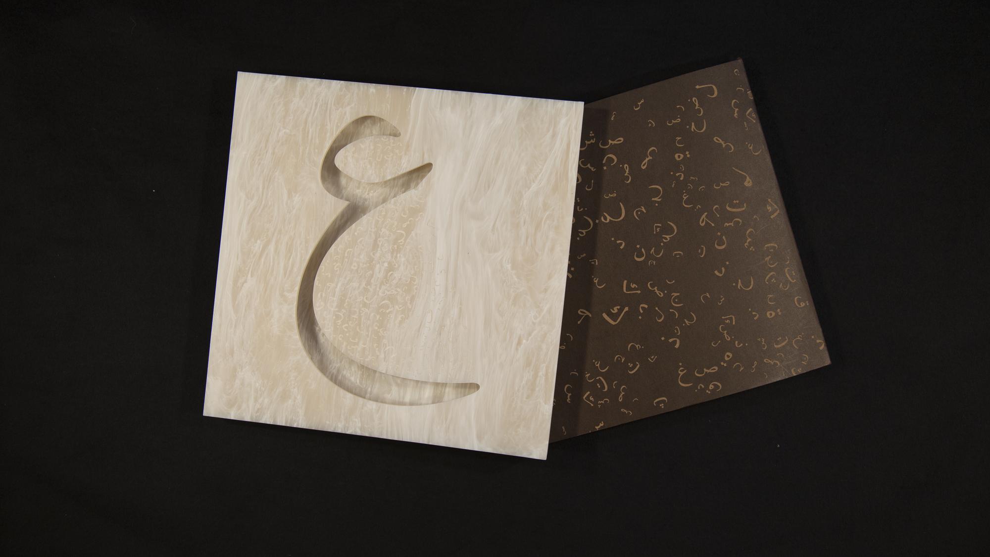
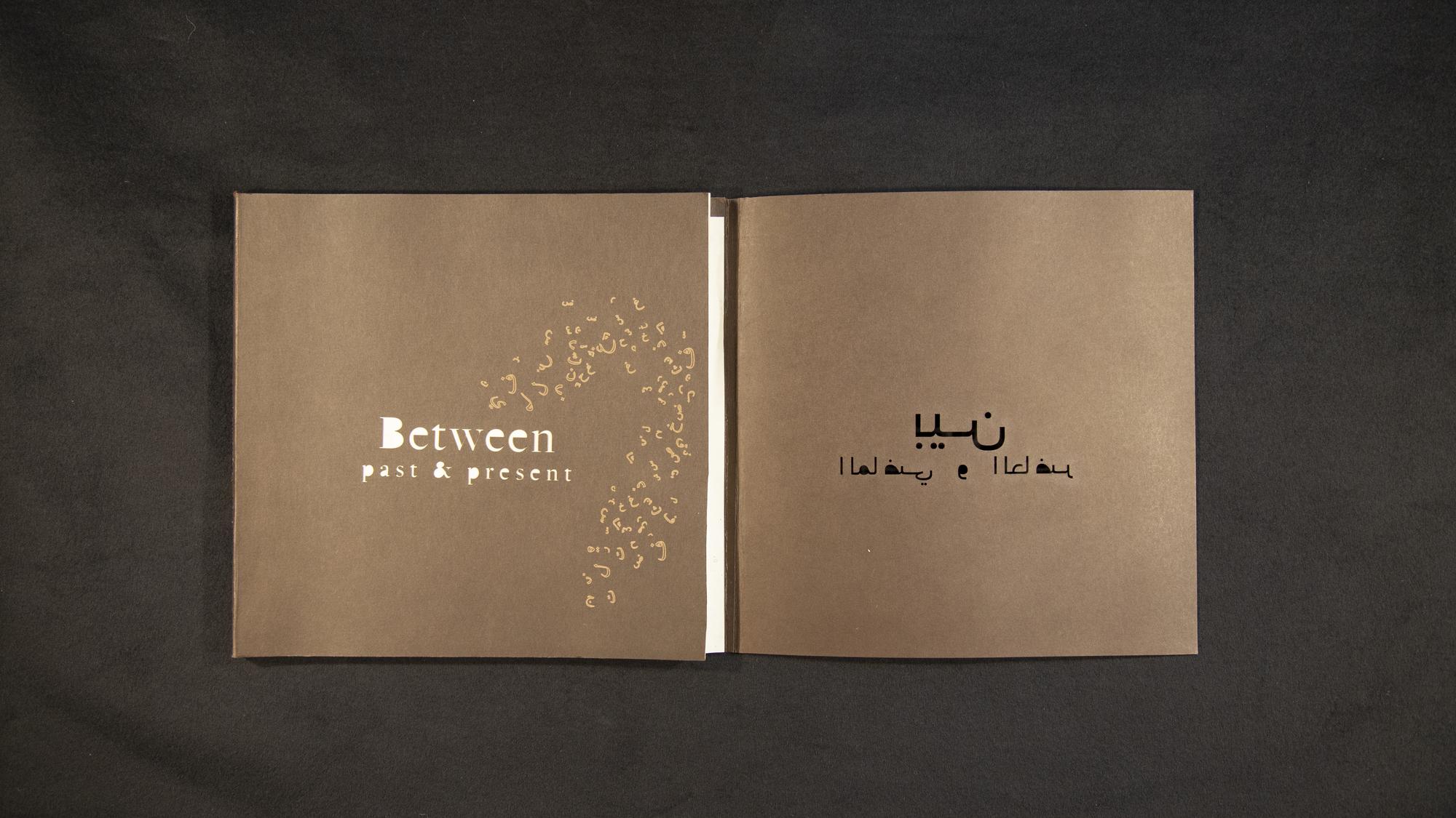
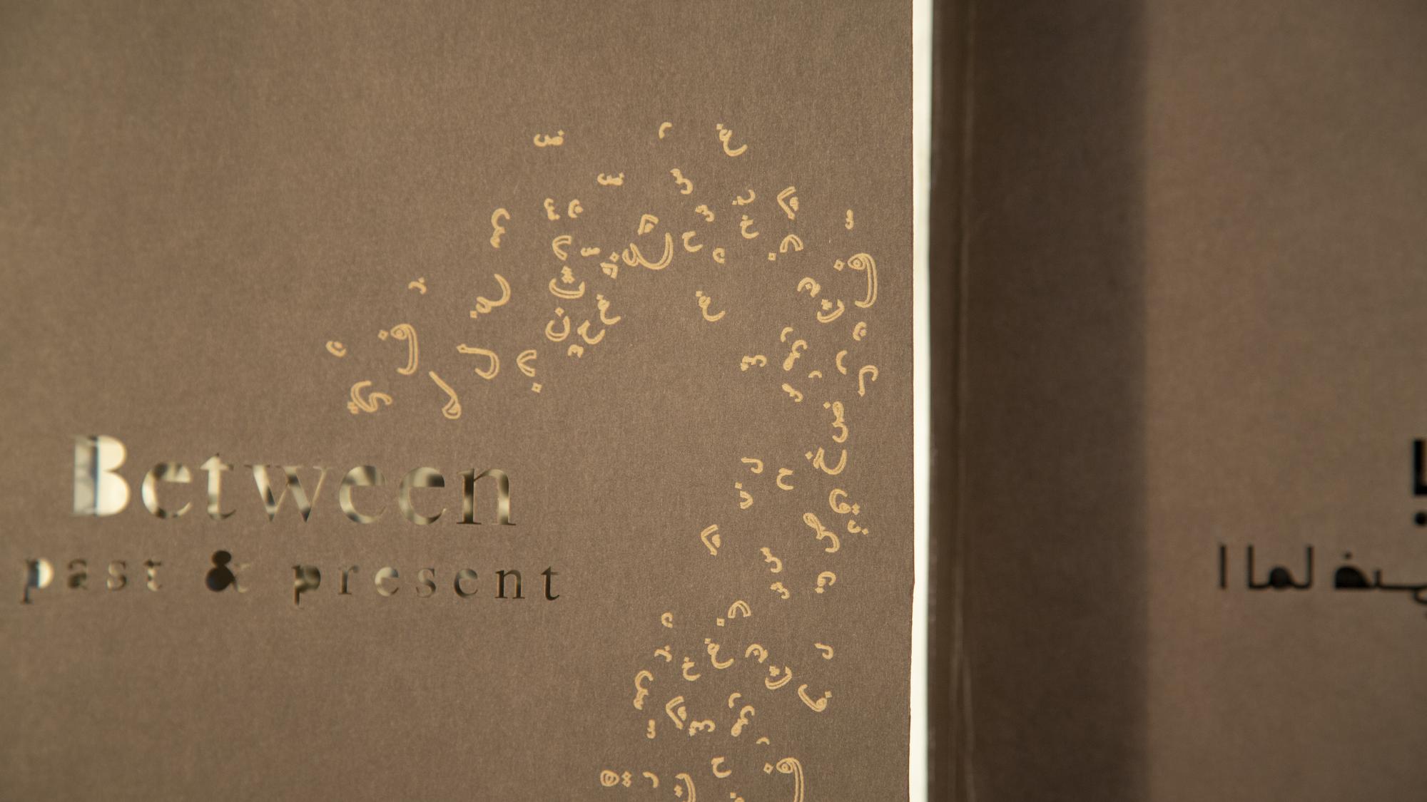
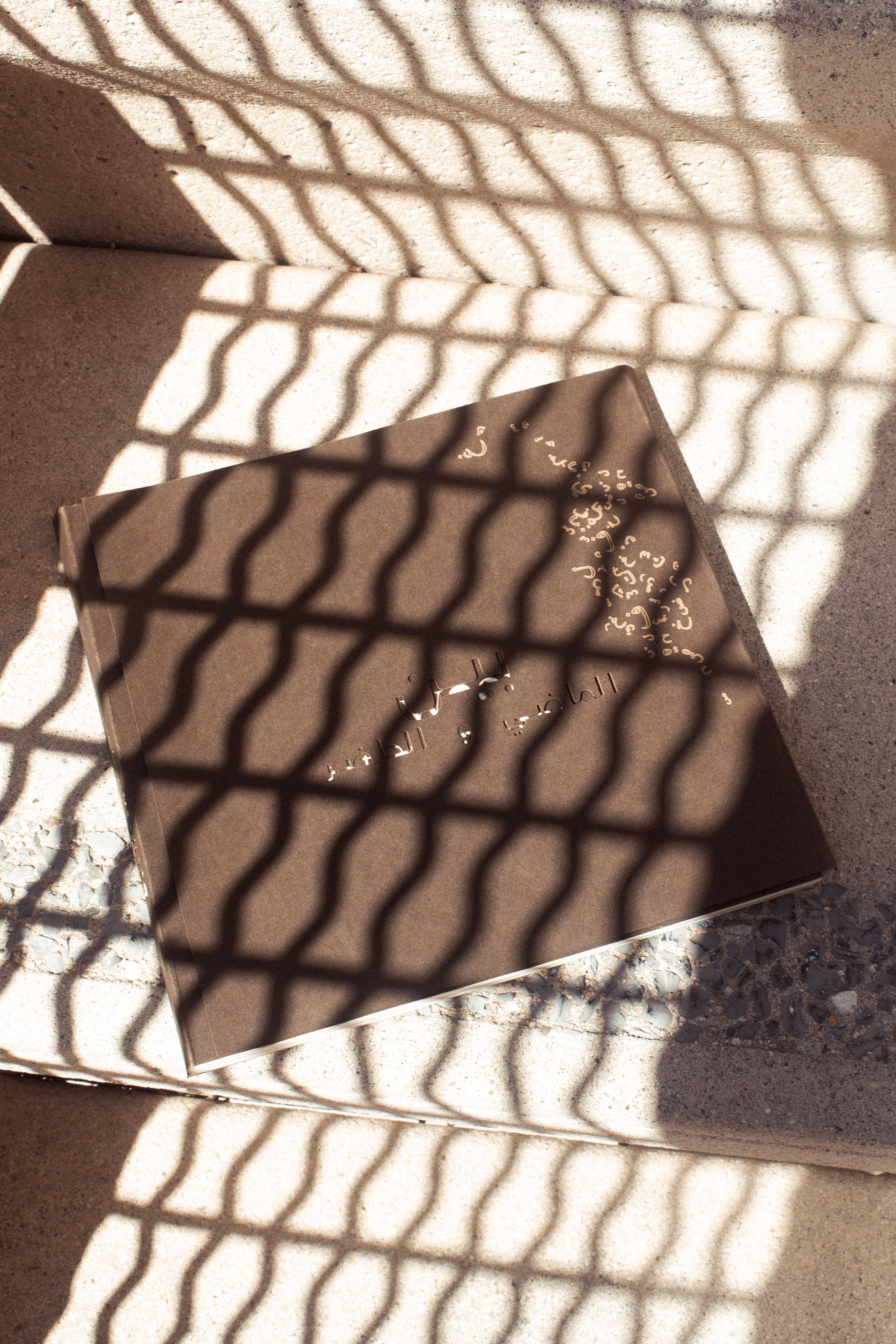
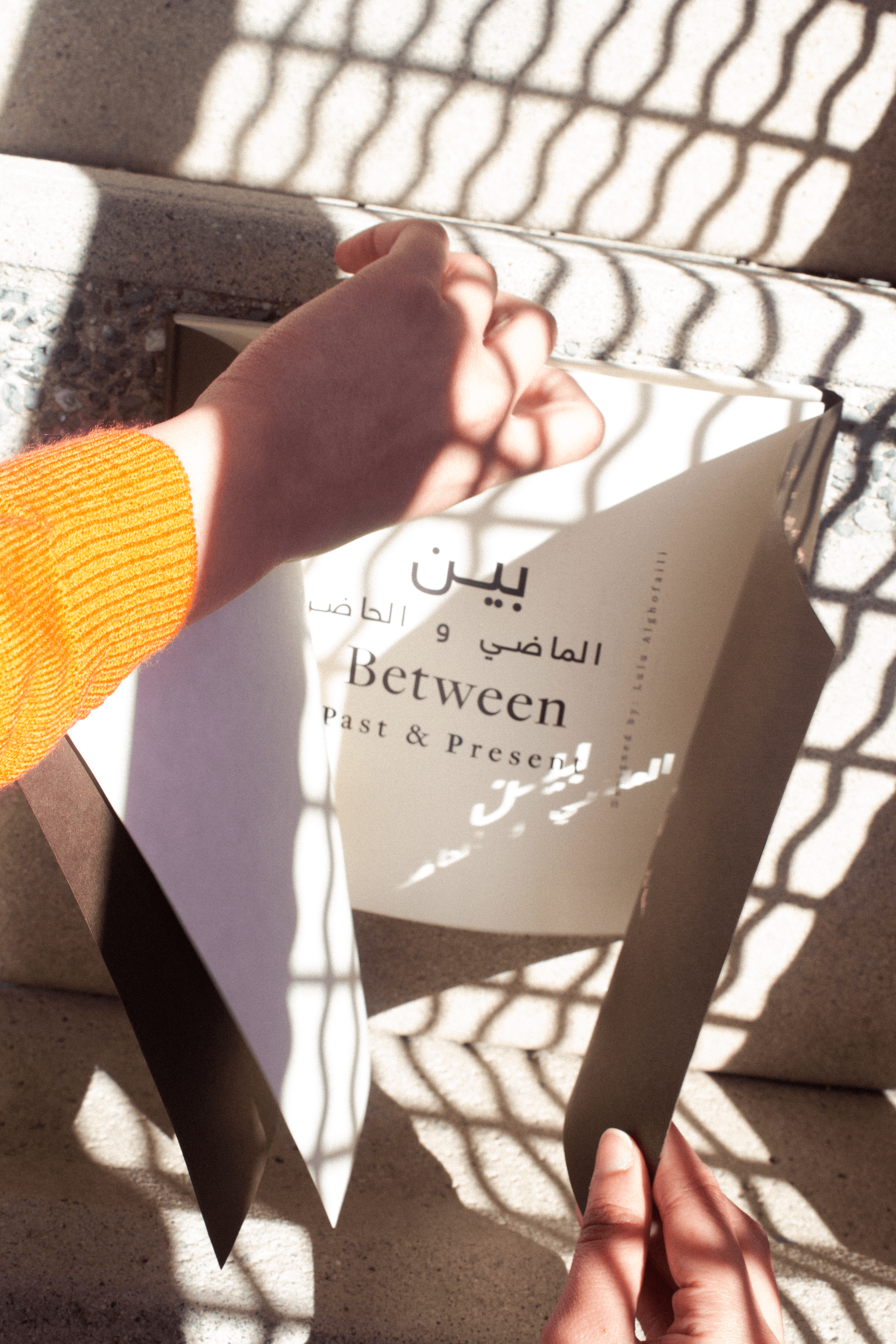
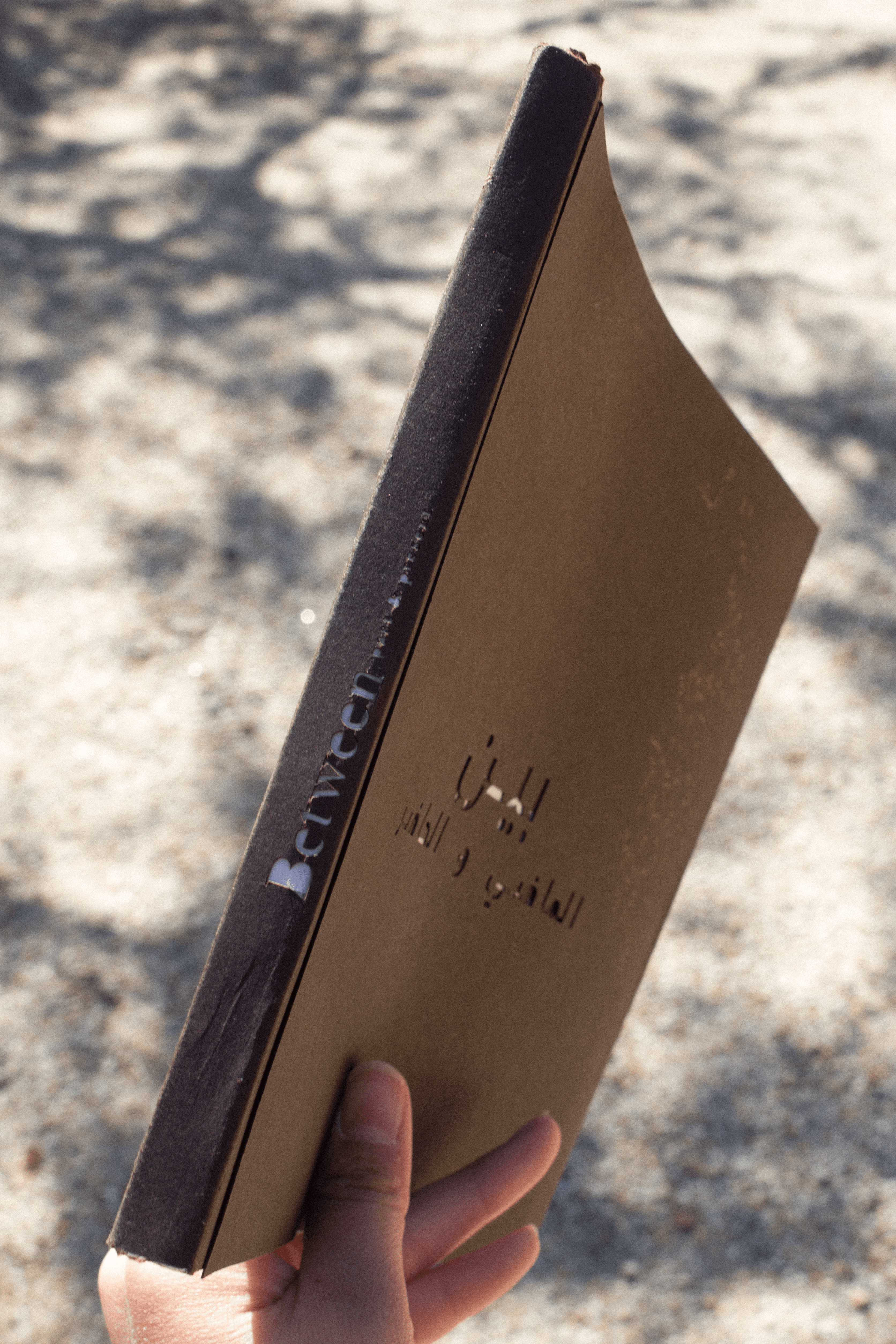
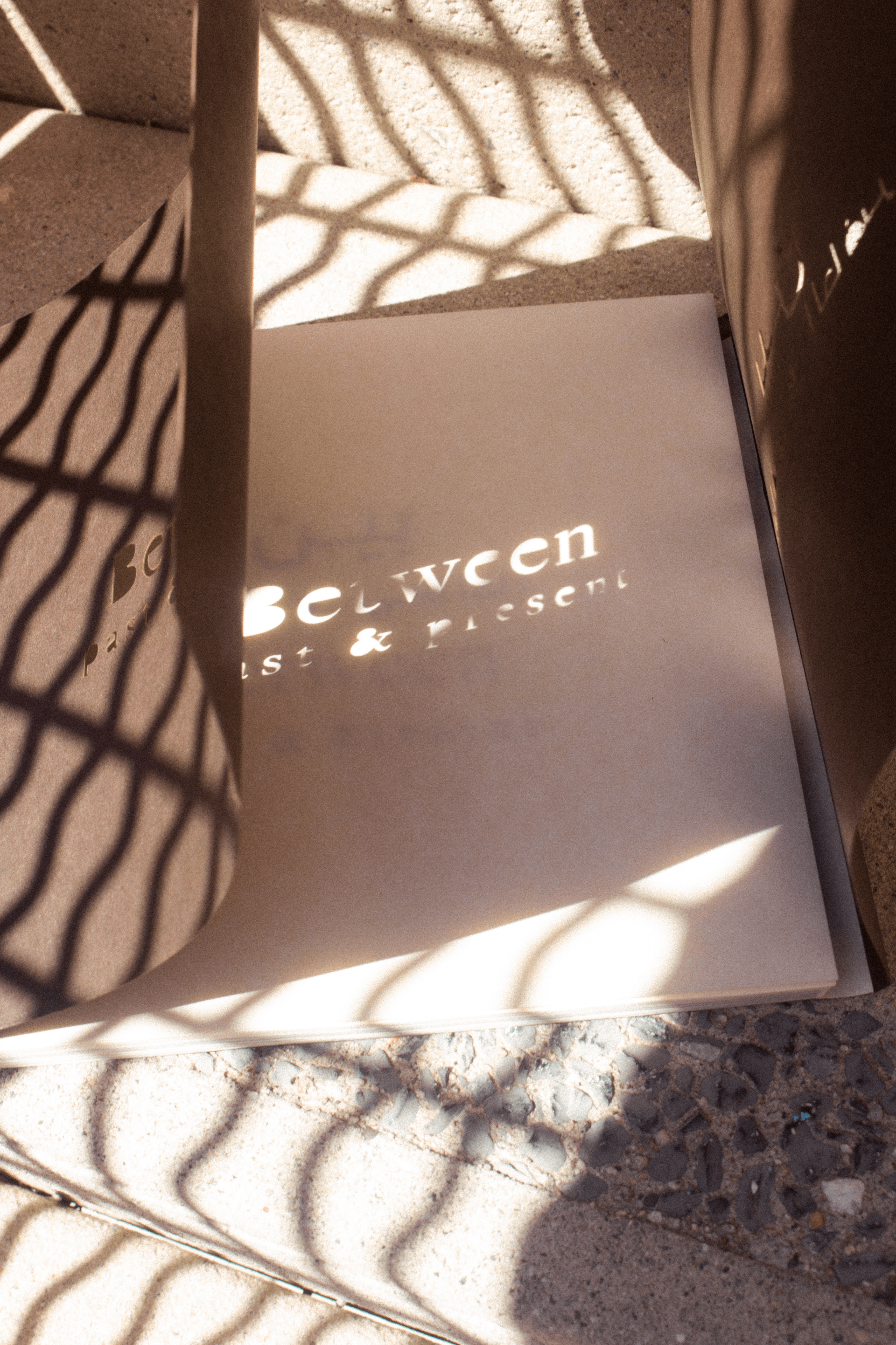
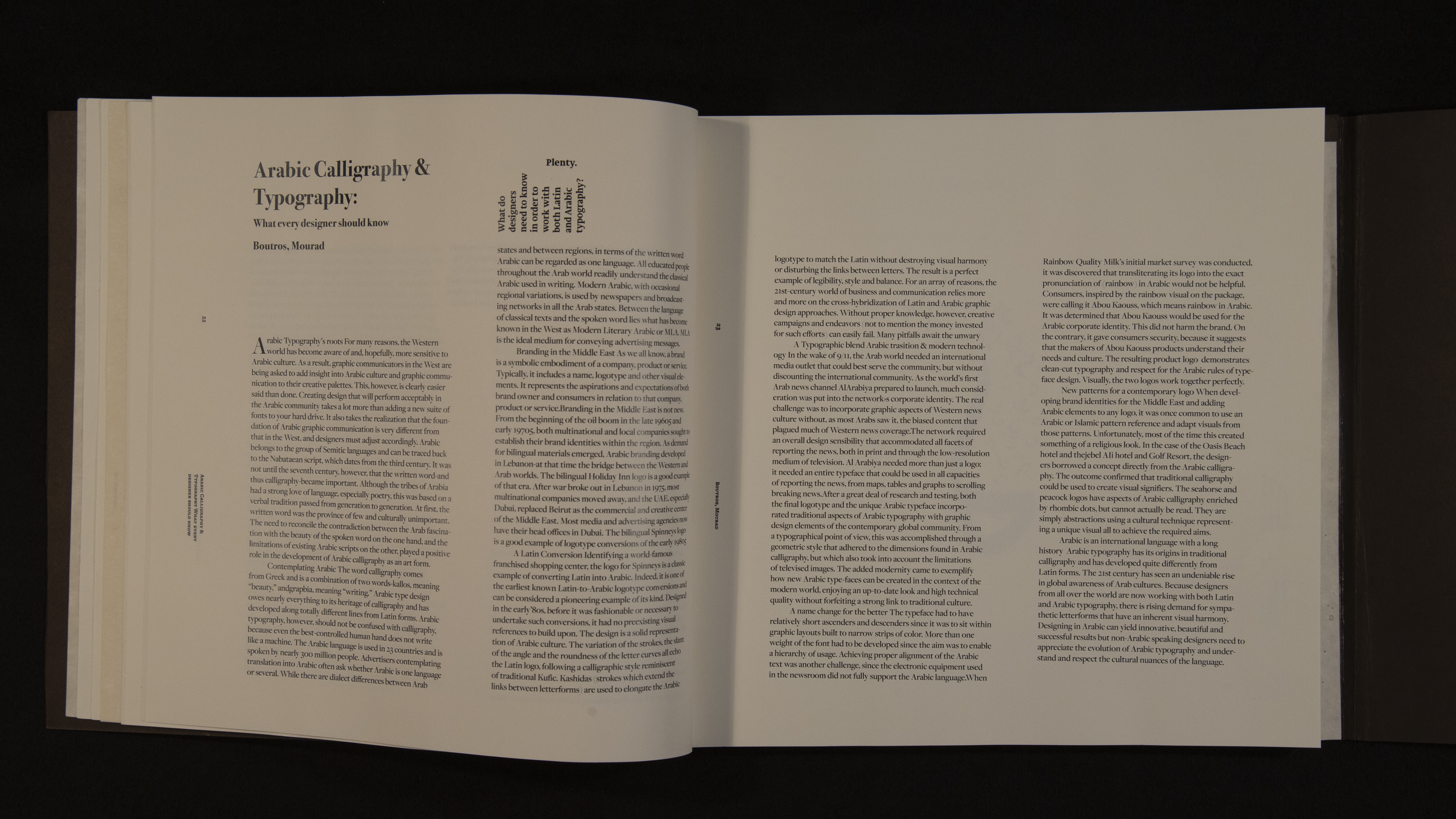
BETWEEN PAST AND PRESENT
Based on Arabic Calligraphy and TypographyBetween Past and Present is a publication that explores the evolution of Arabic typography and calligraphy. The book features two covers, designed to reflect the unique reading directions of both English (left to right) and Arabic (right to left). The chapter openings are intricately engraved and laser-cut, adding a tactile dimension to the design. The cover is crafted from marble acrylic sheets, giving it a sophisticated and timeless feel that honors the rich cultural heritage of Arabic calligraphy while embracing modern design techniques.
Medium: Mixed Media, engraving, and laser cut
Size: 8X8”
Year:2018

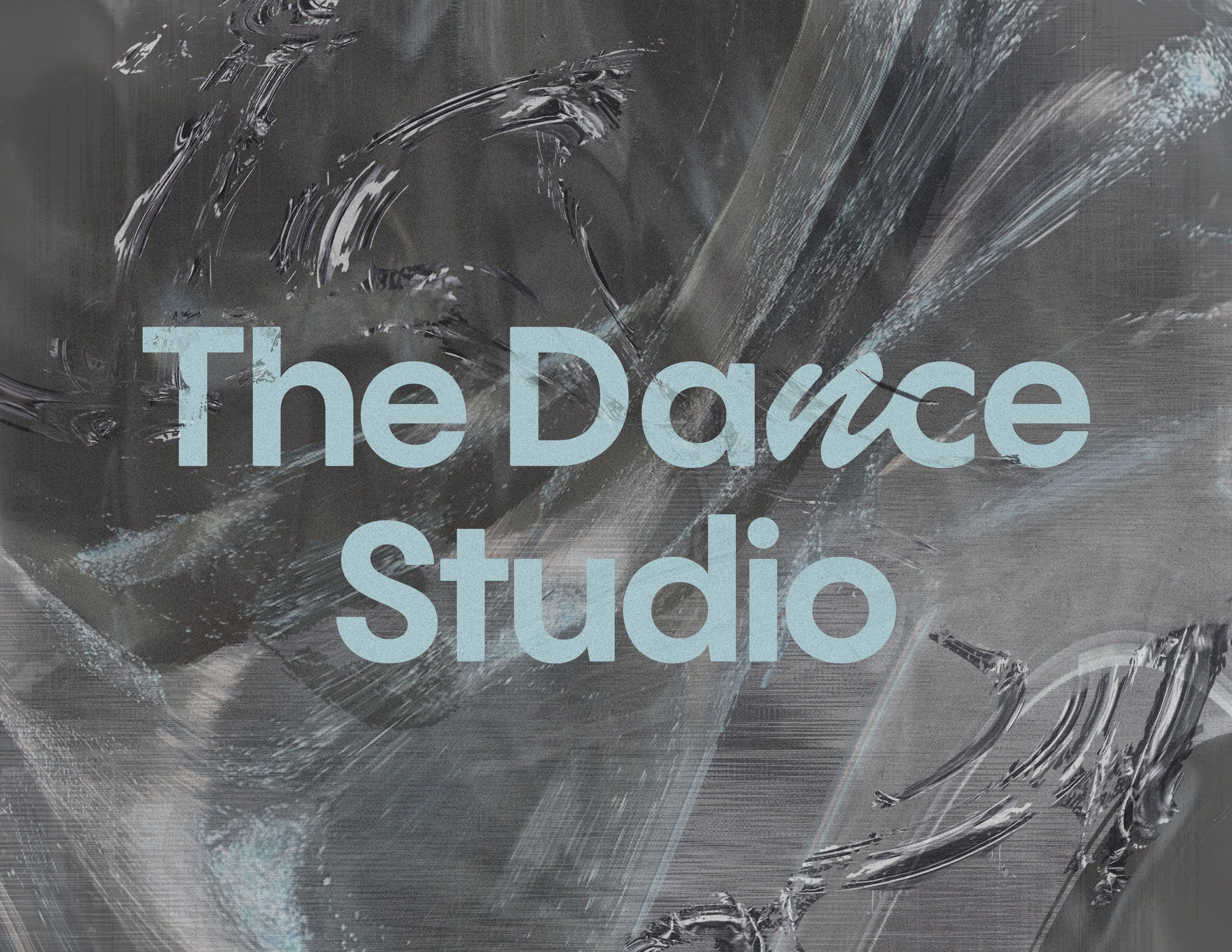
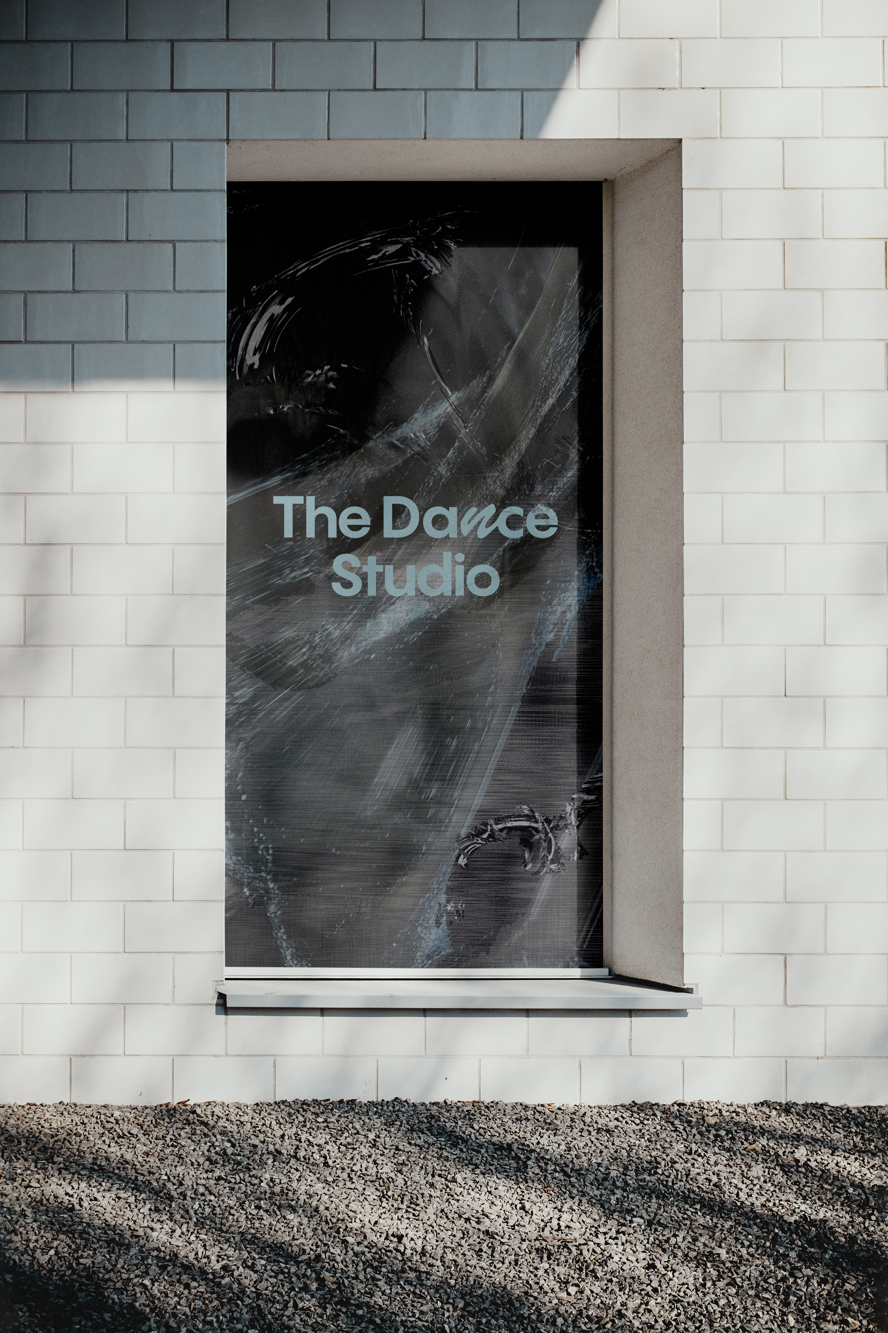
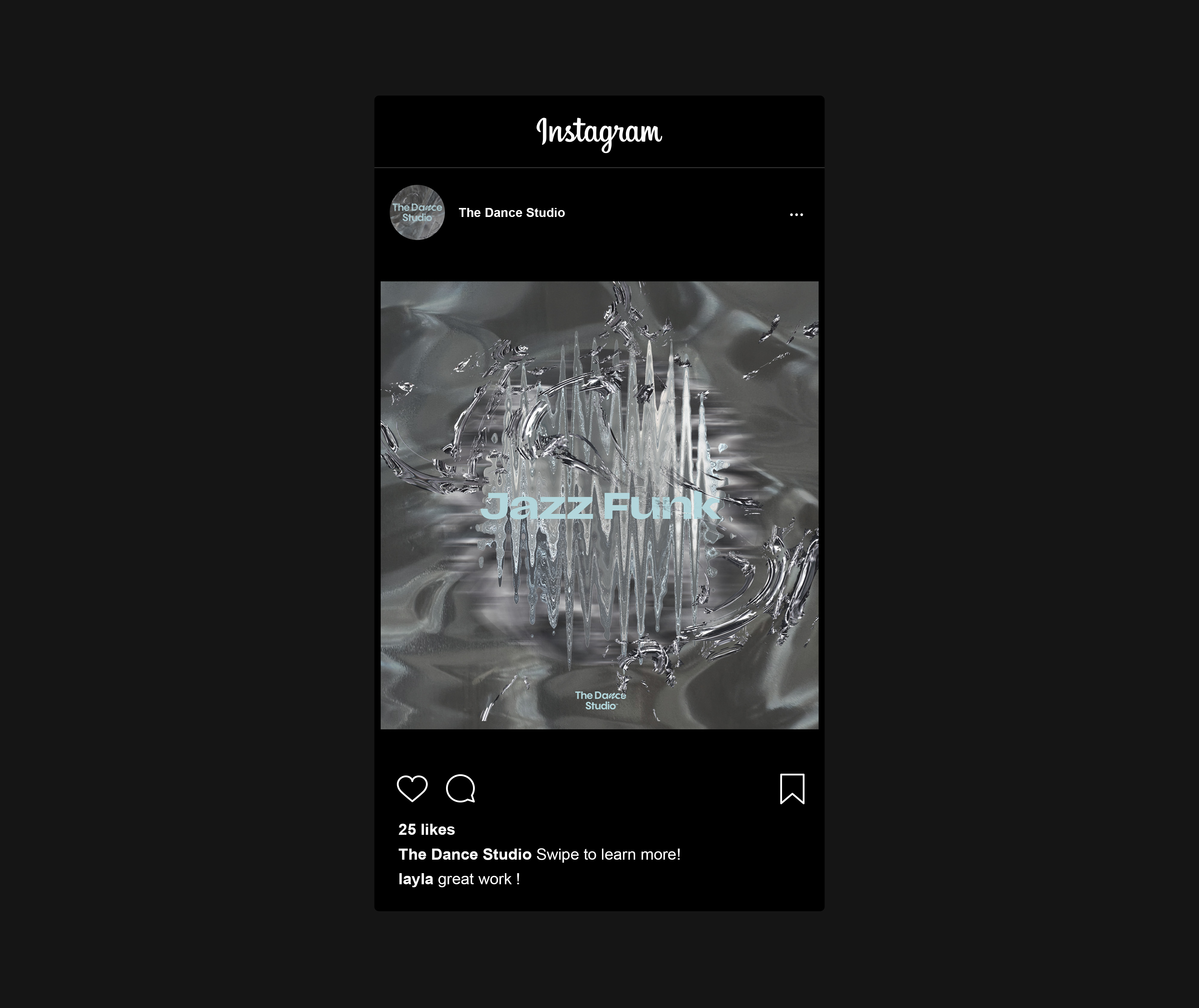
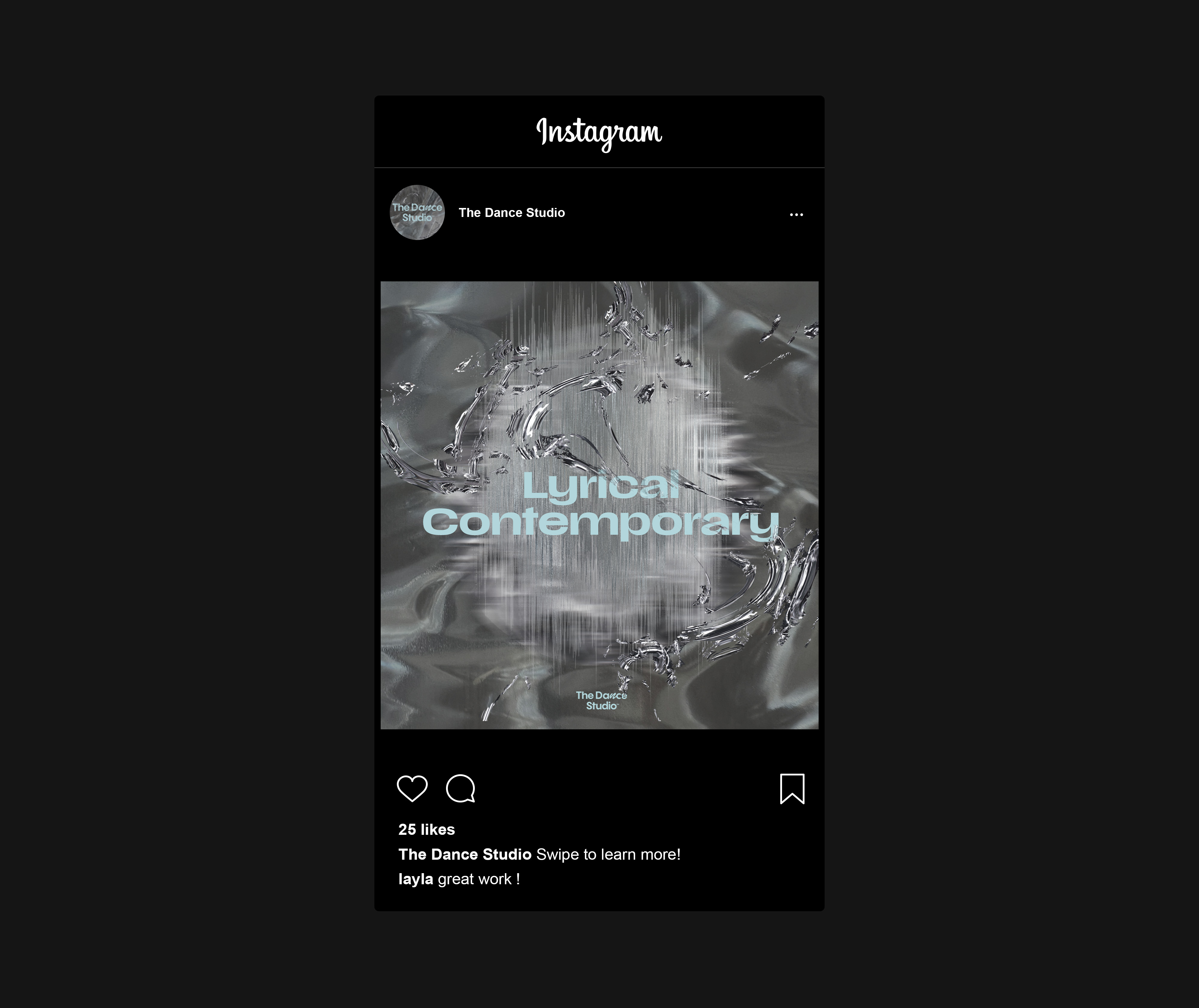
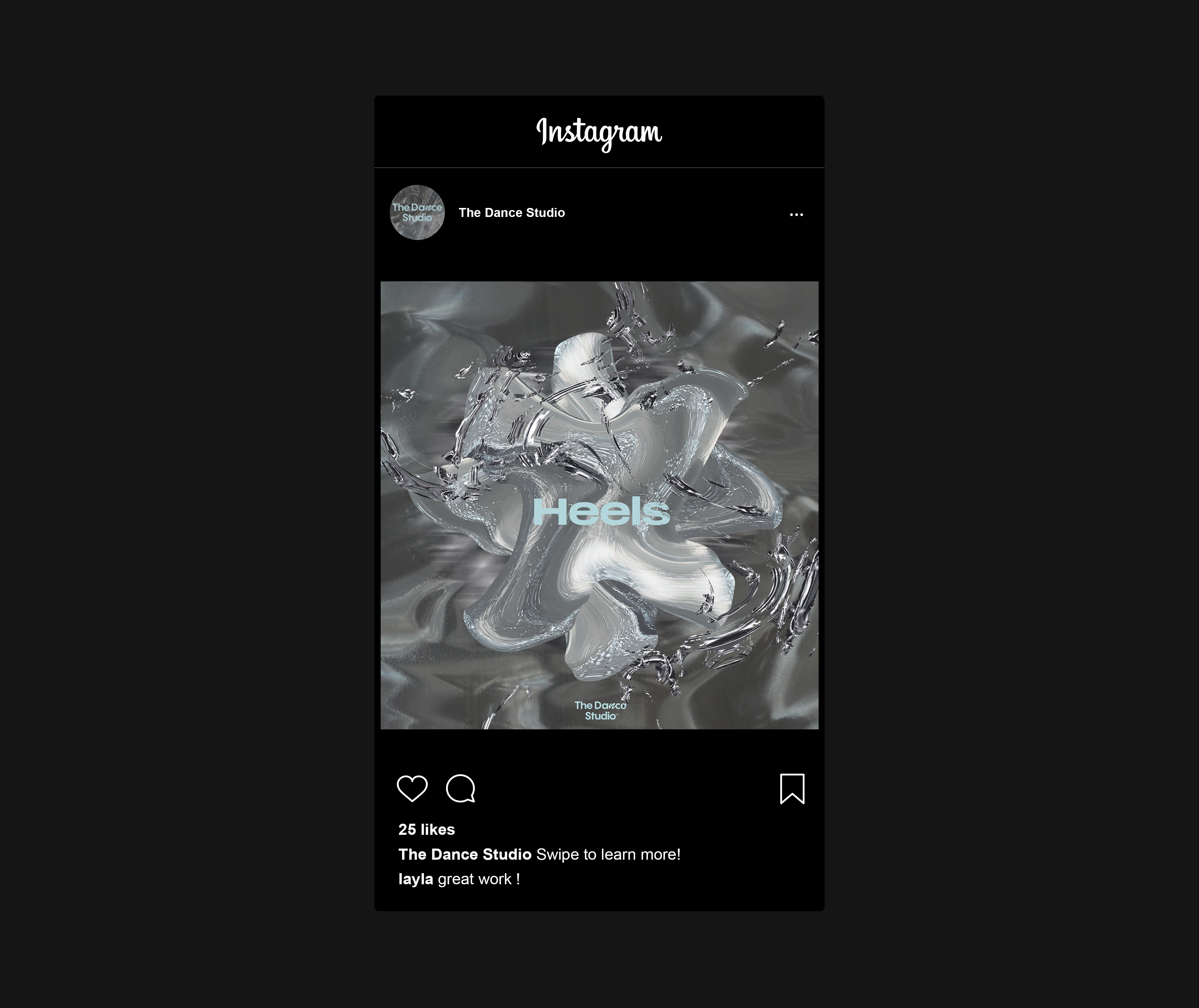
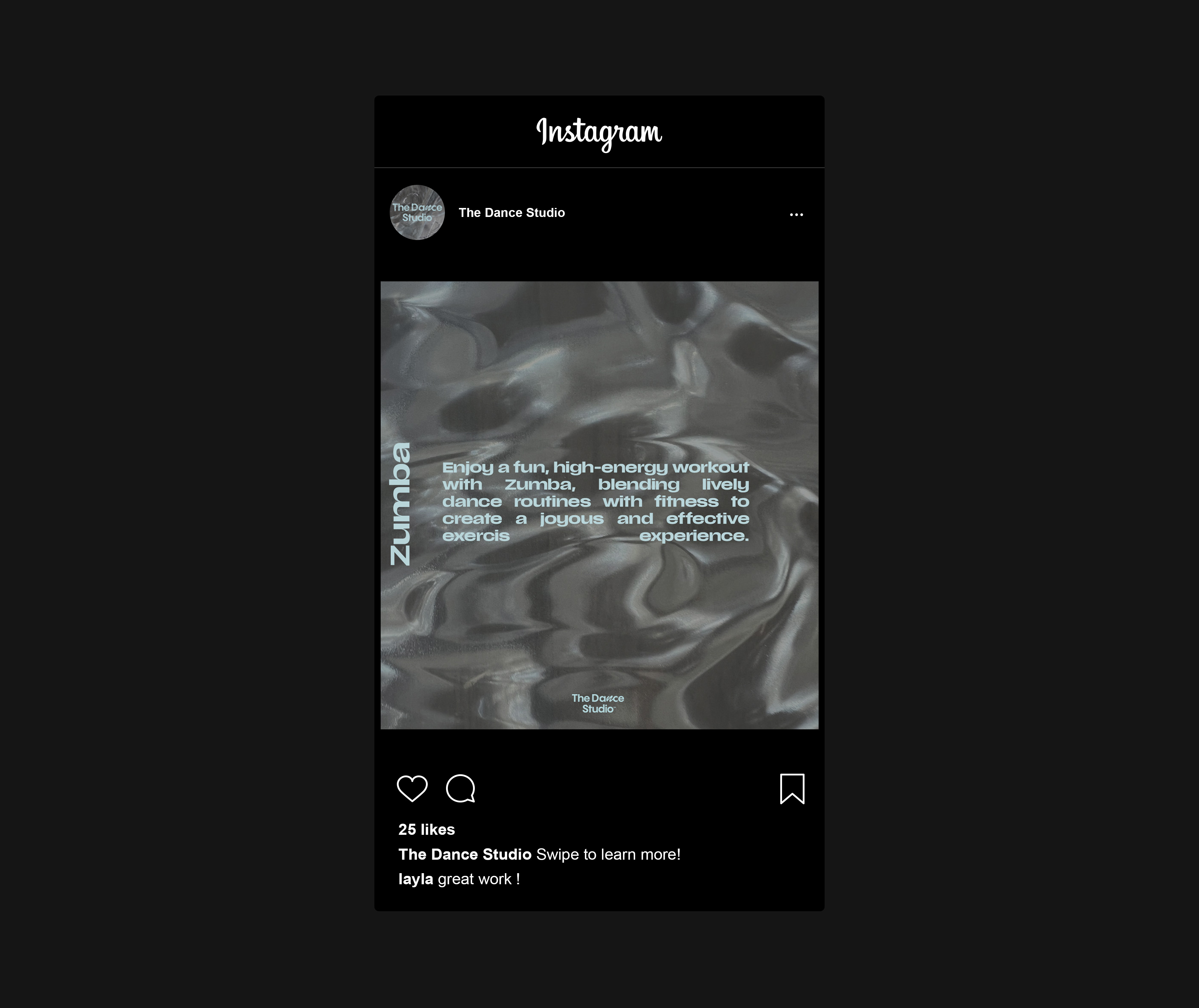
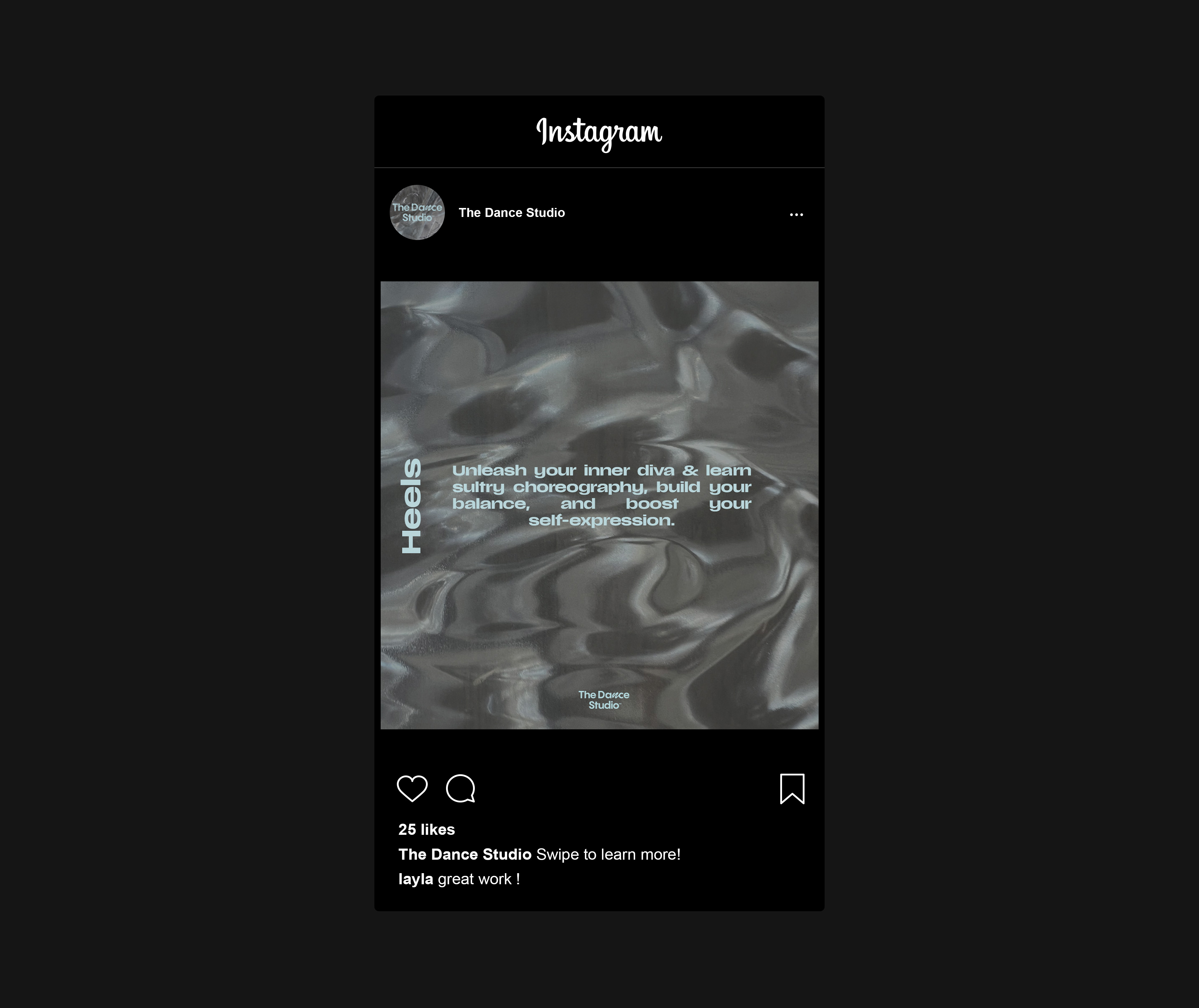
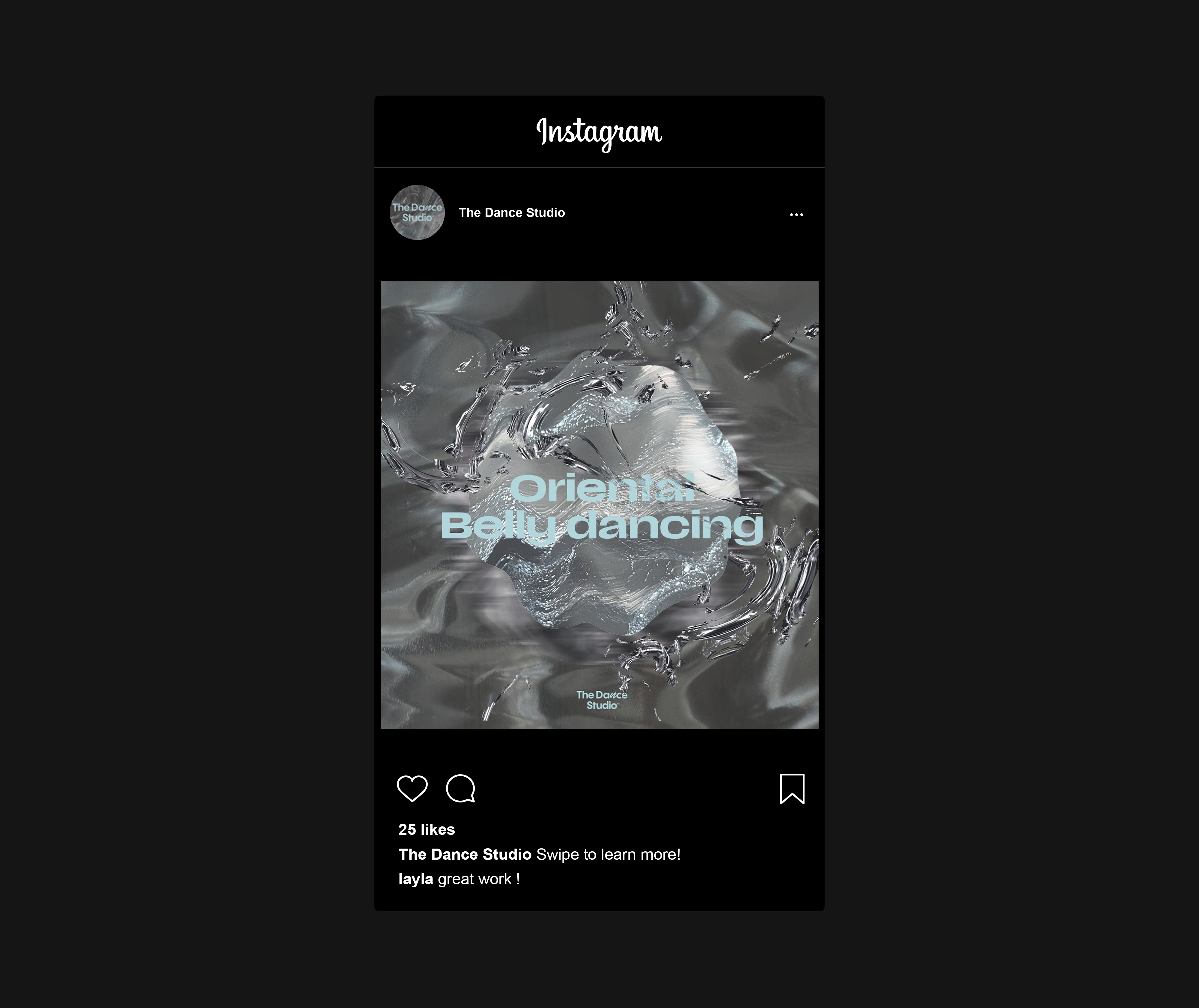
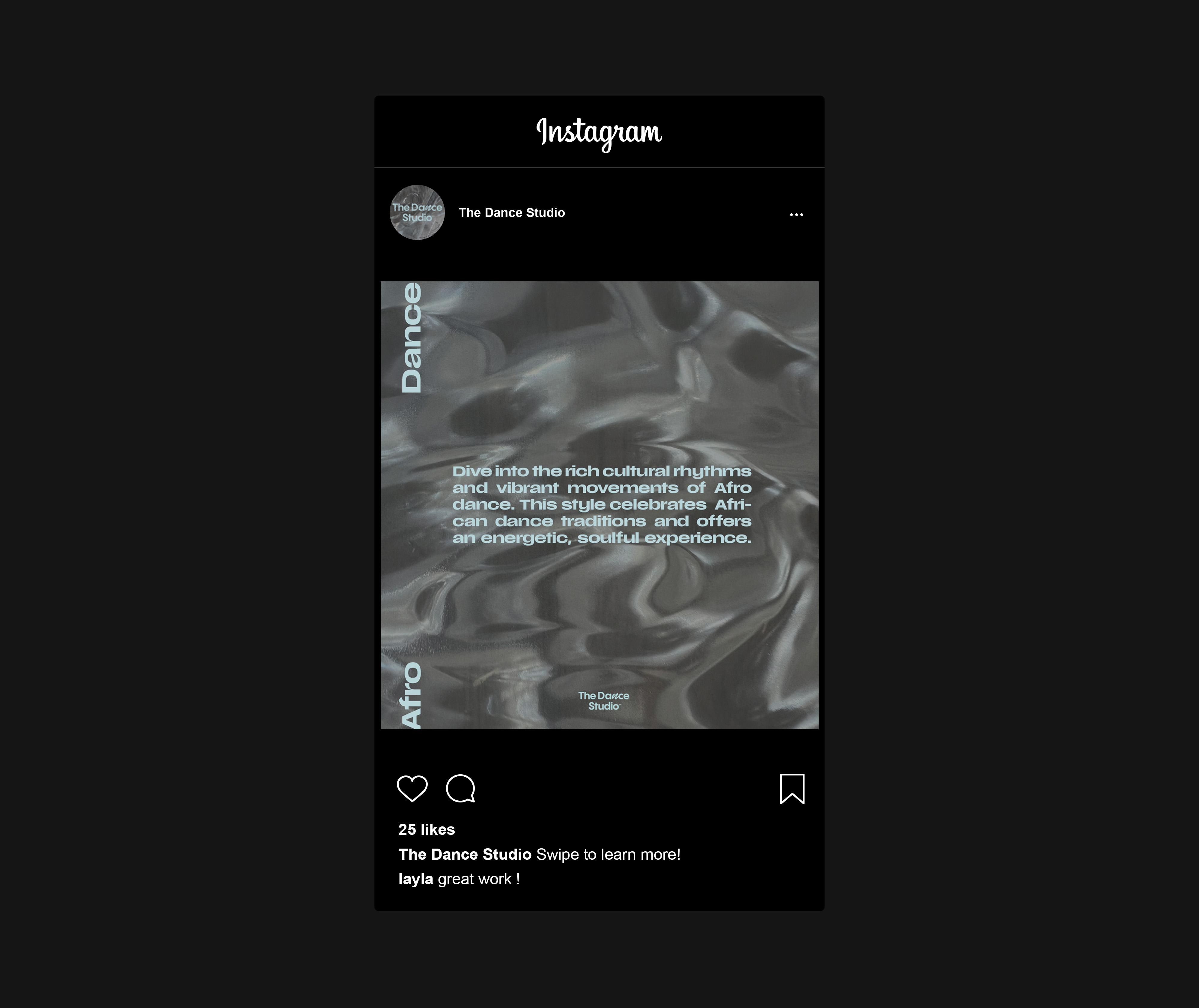
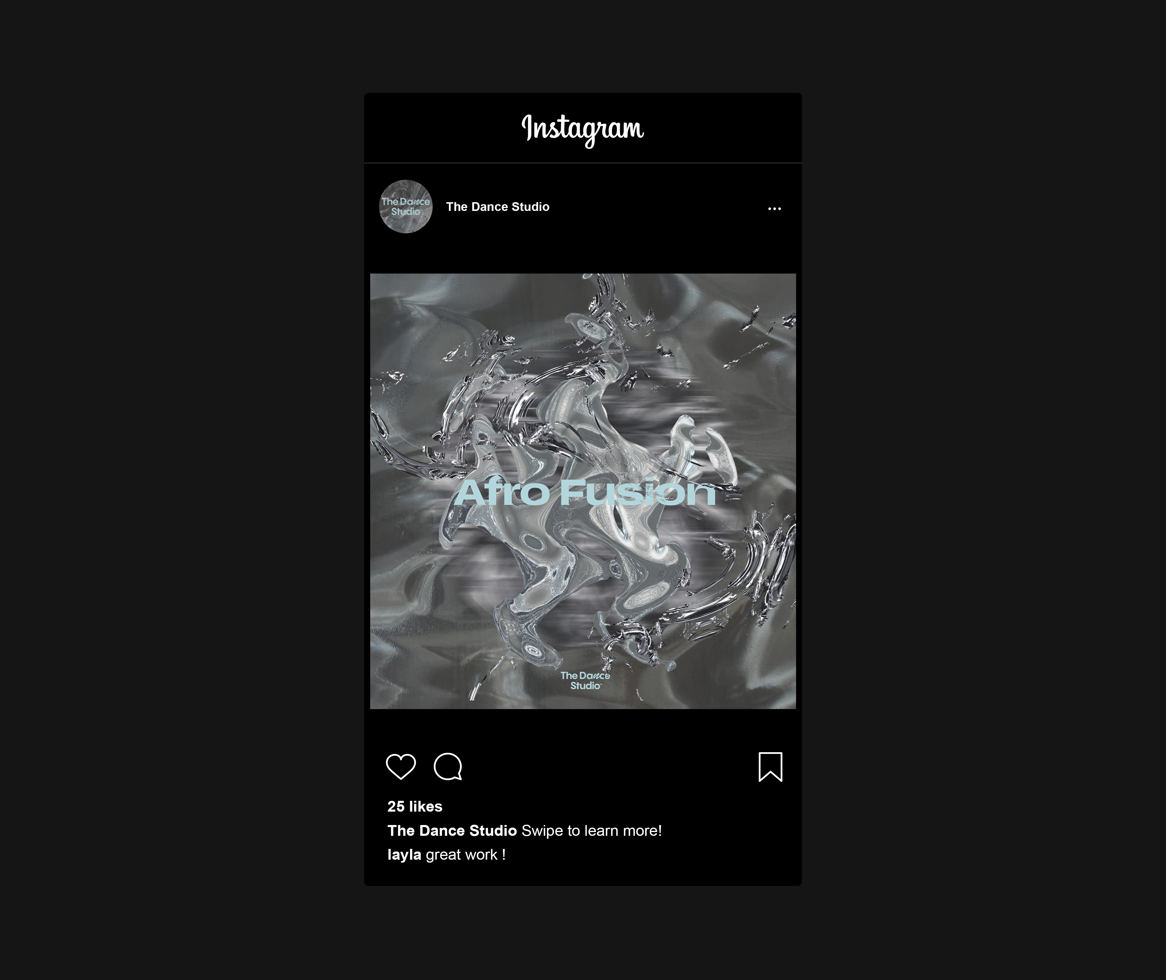
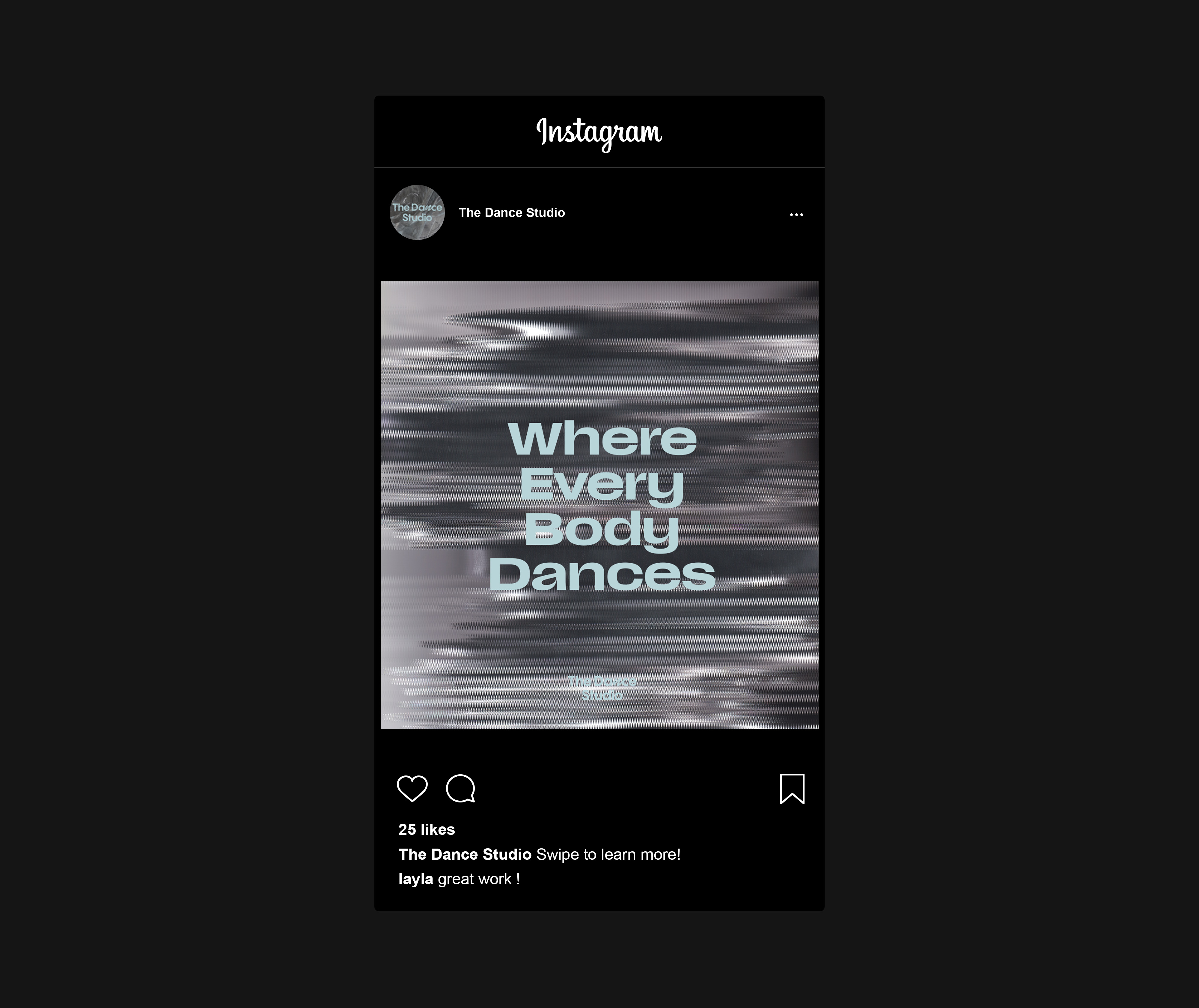
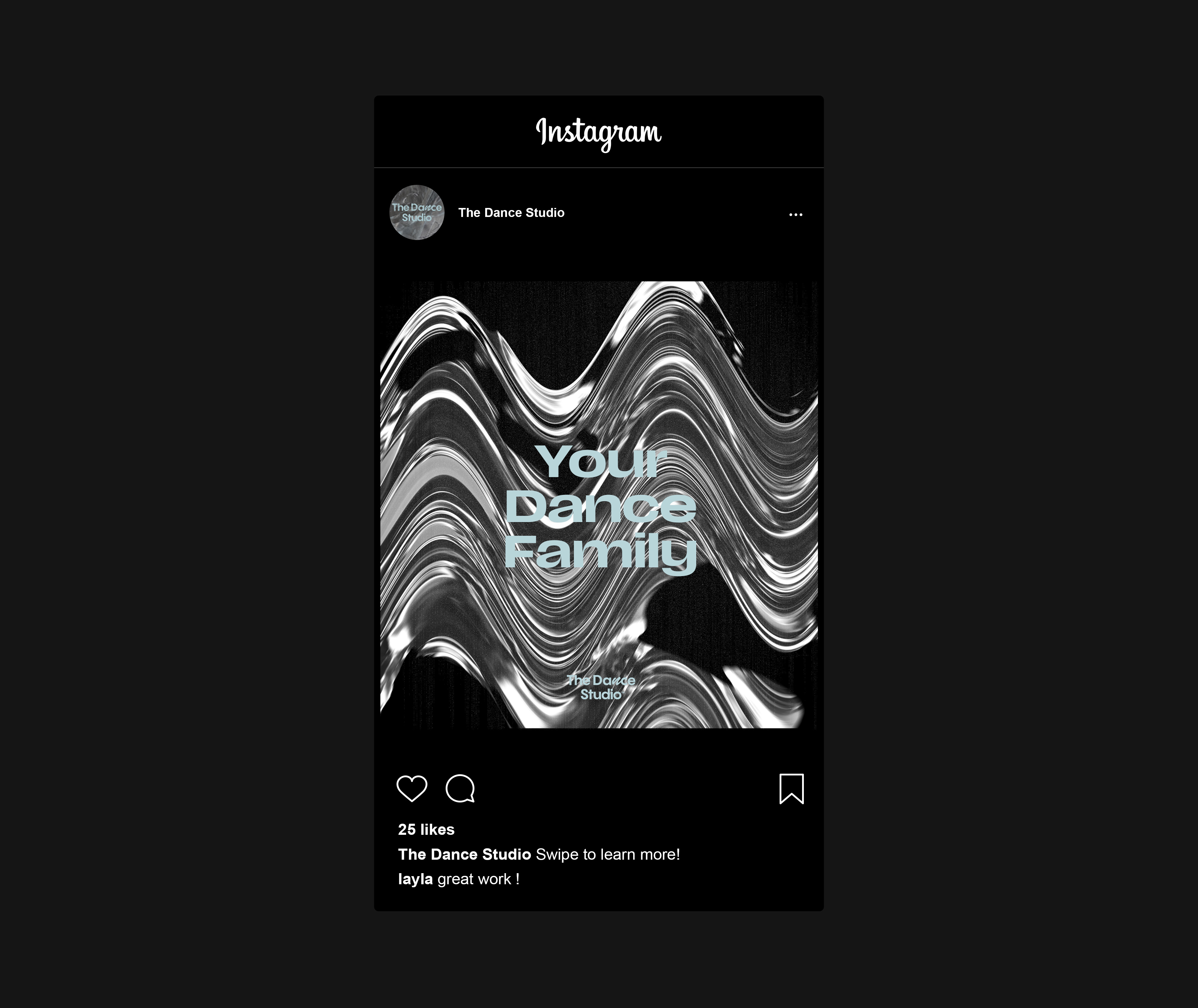
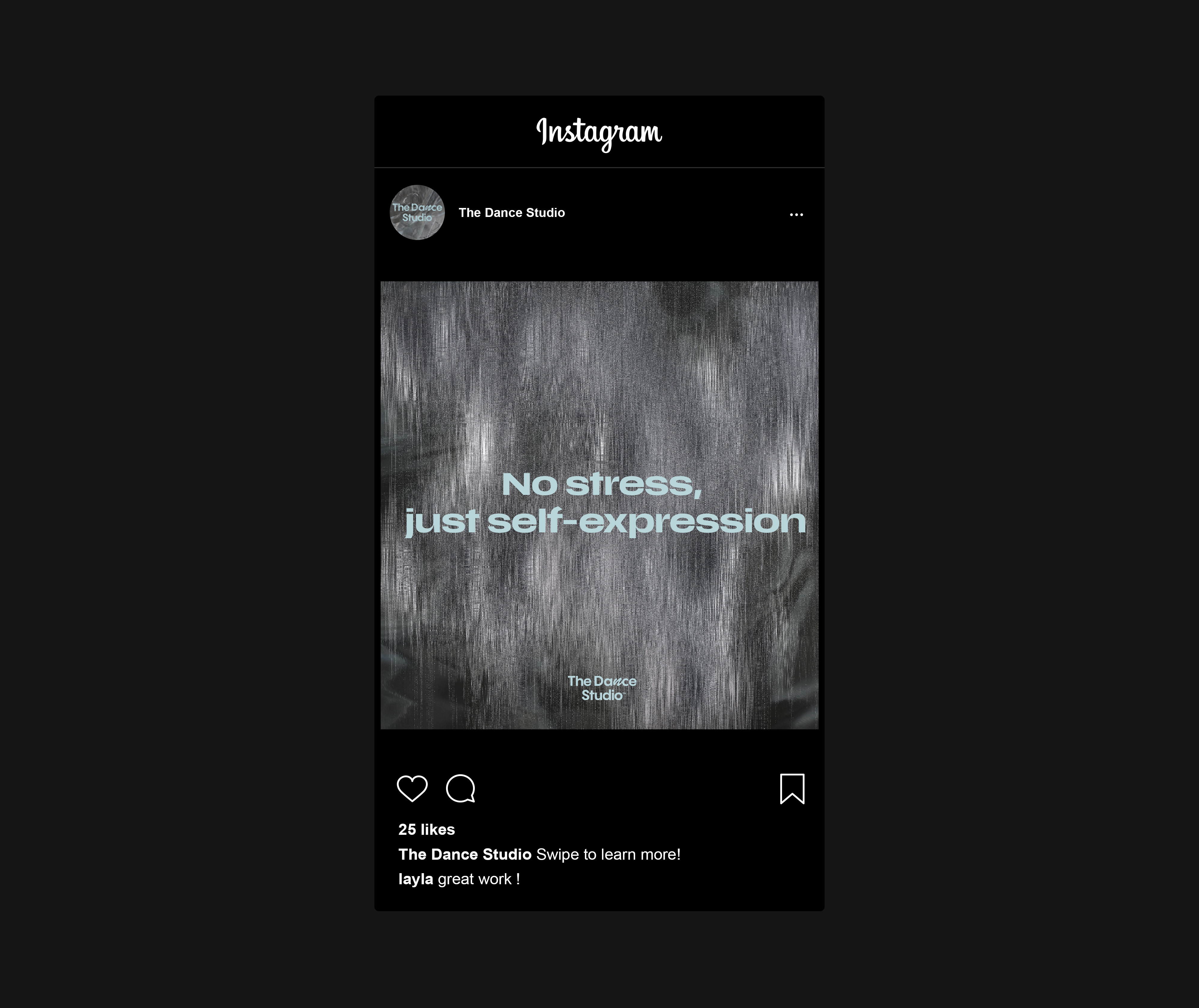
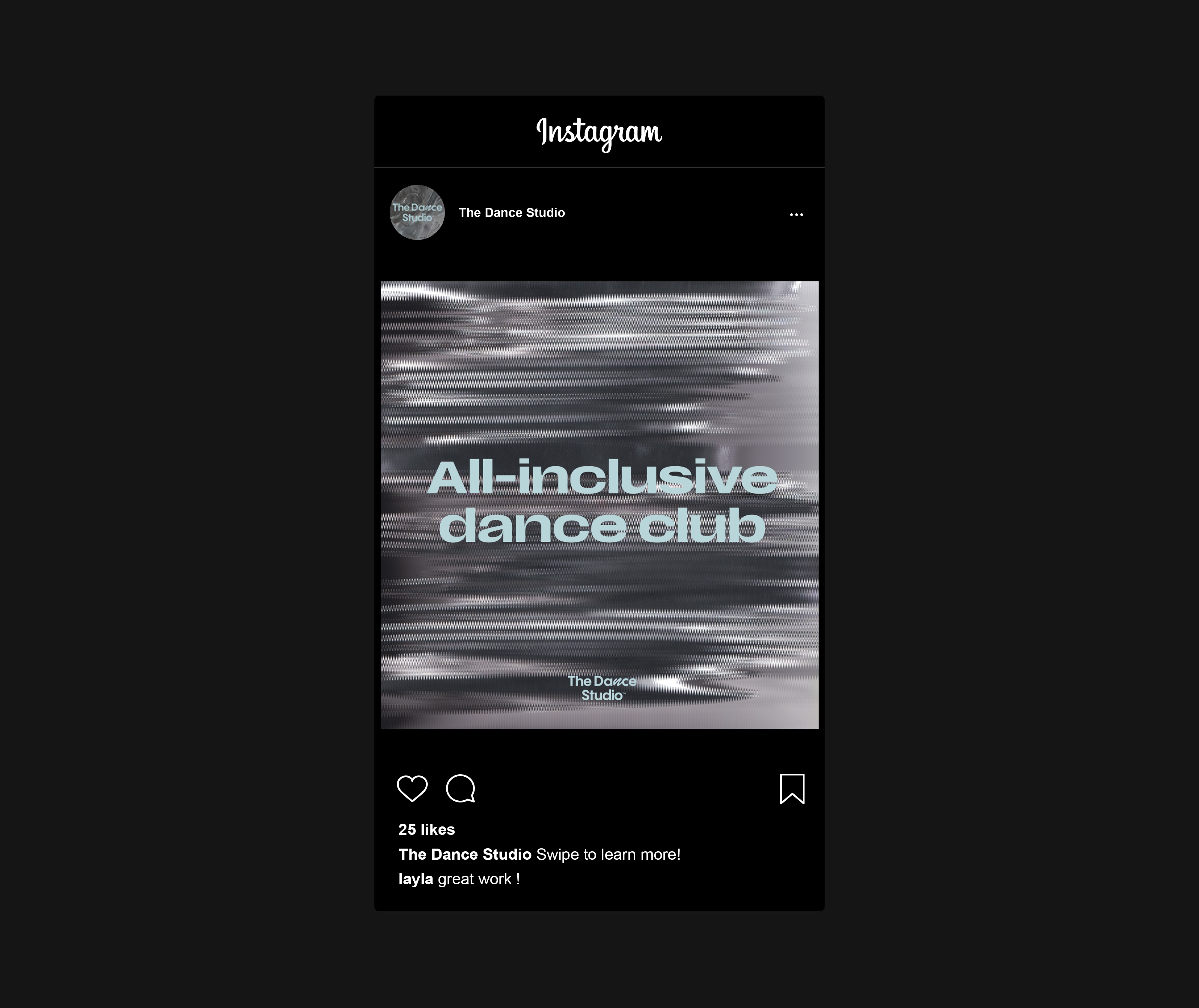
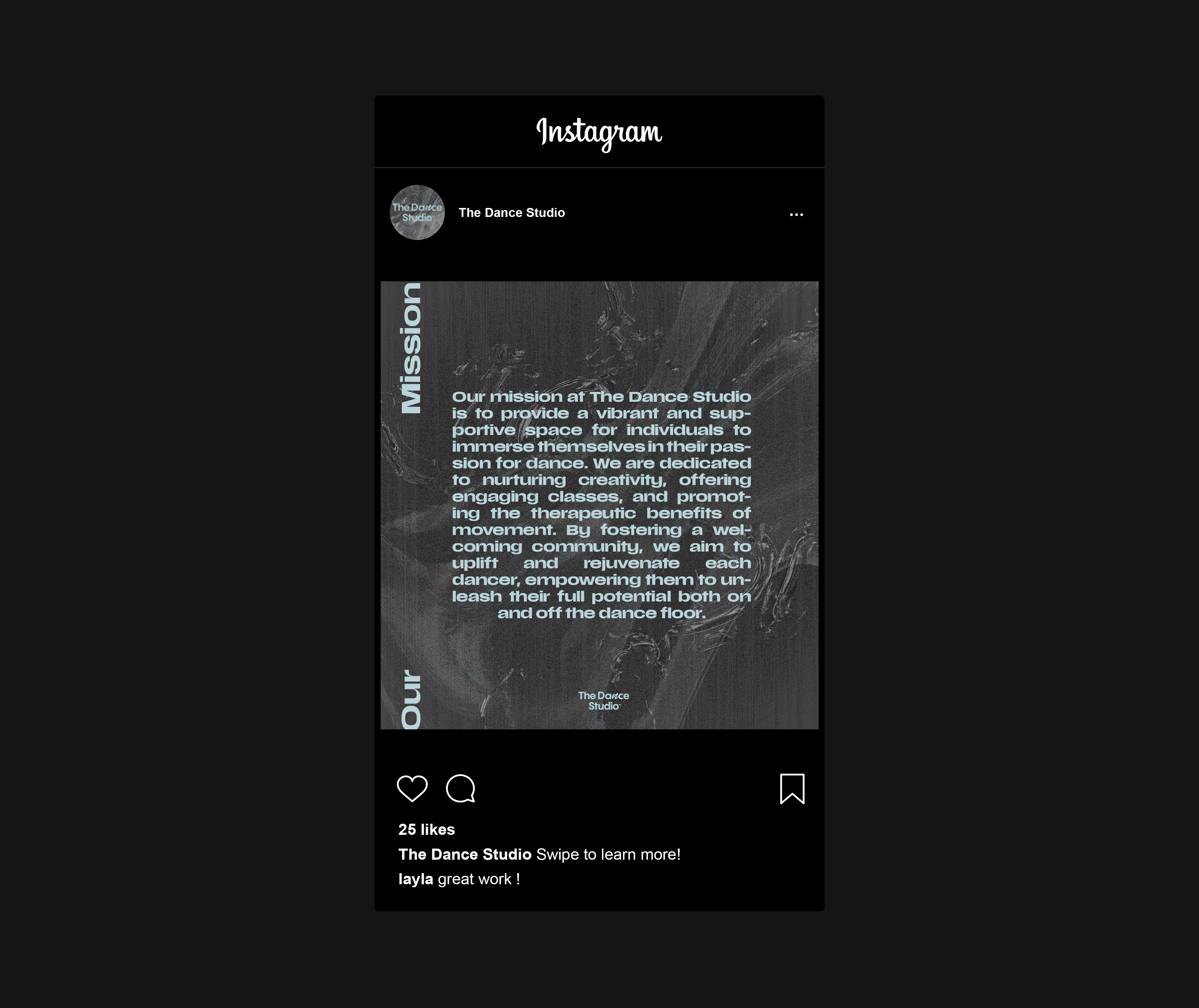
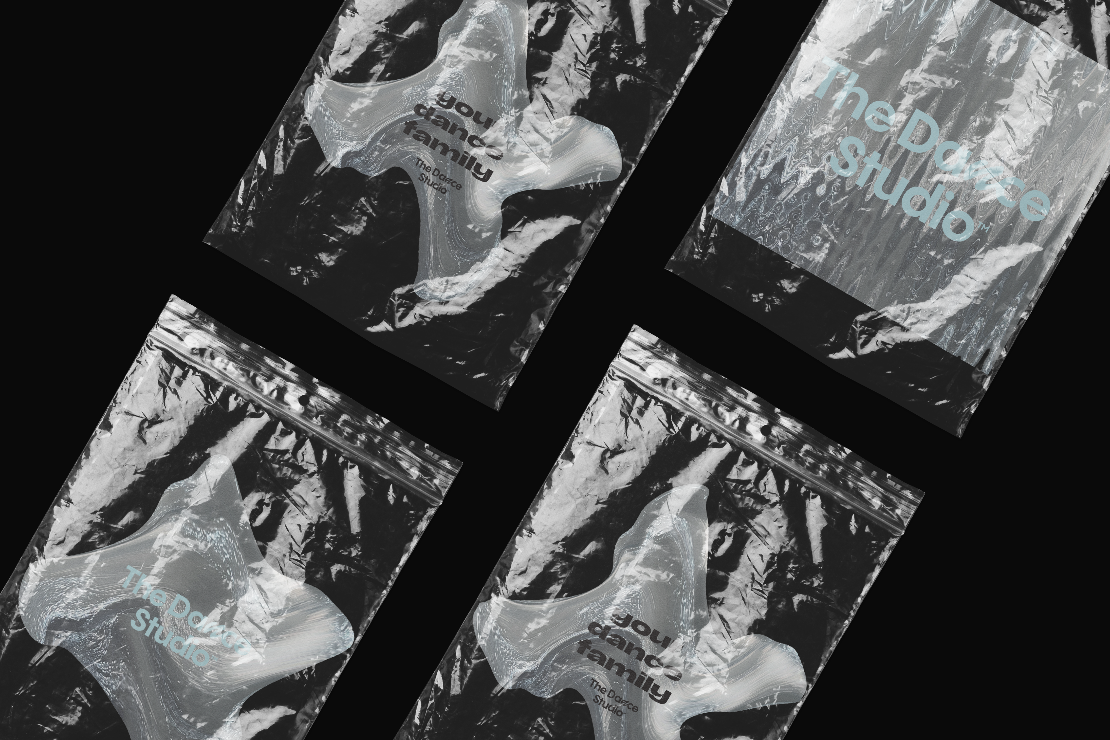
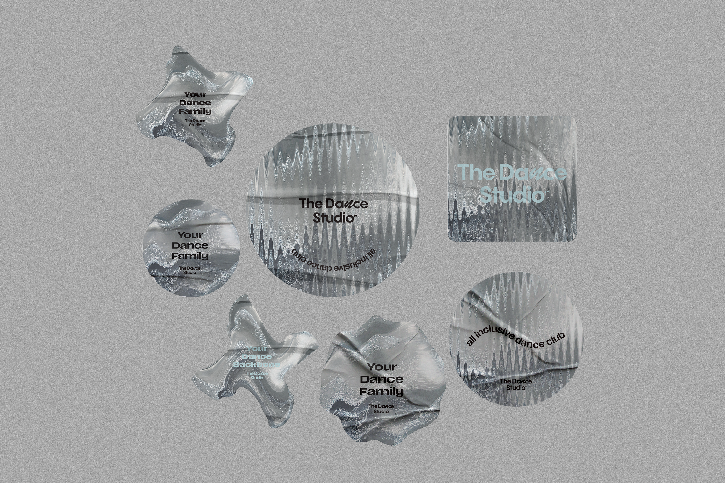
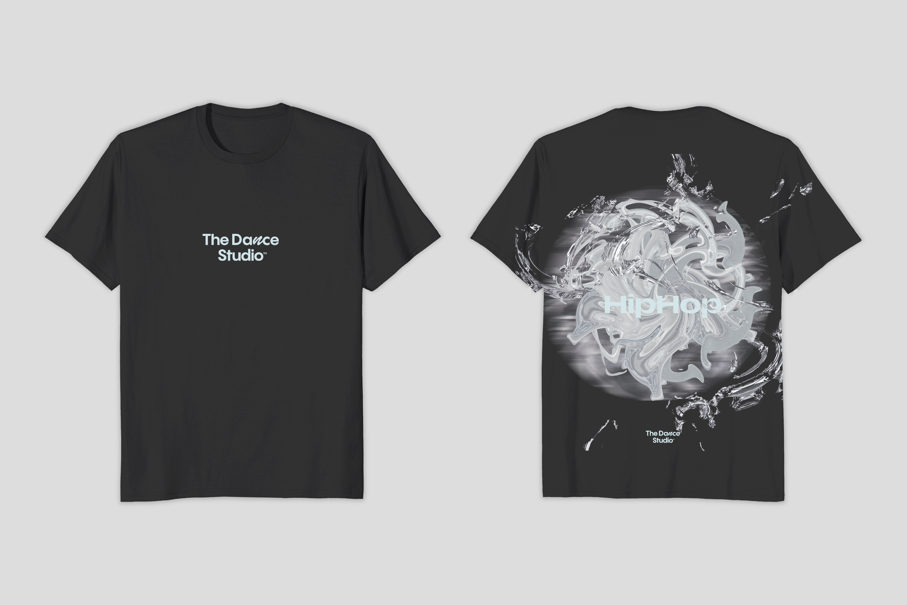
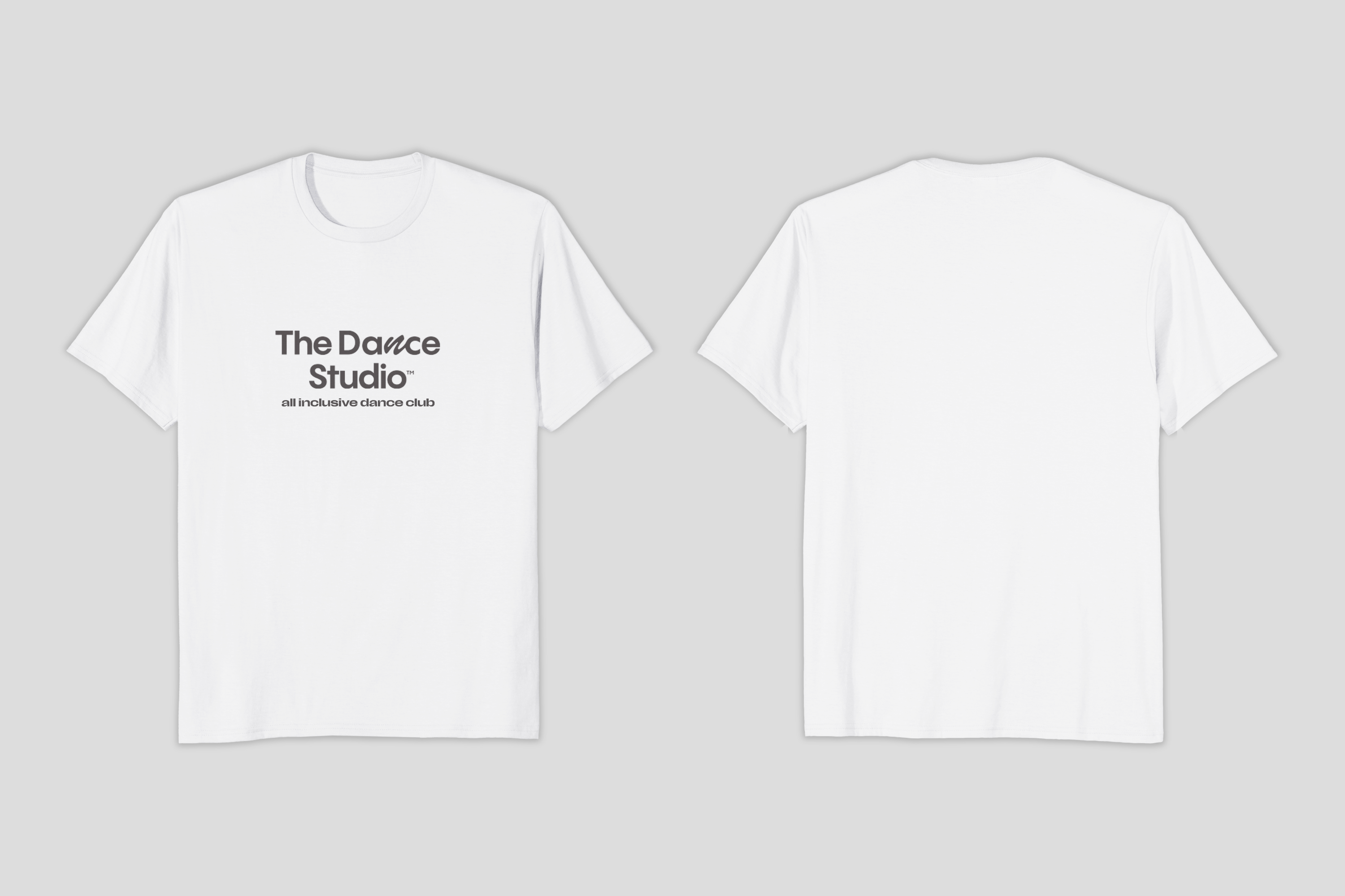
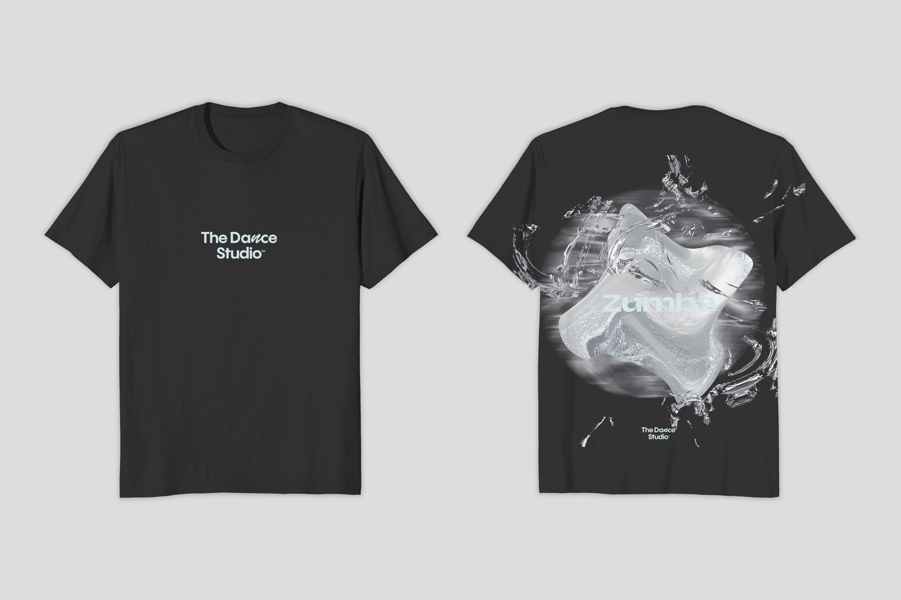
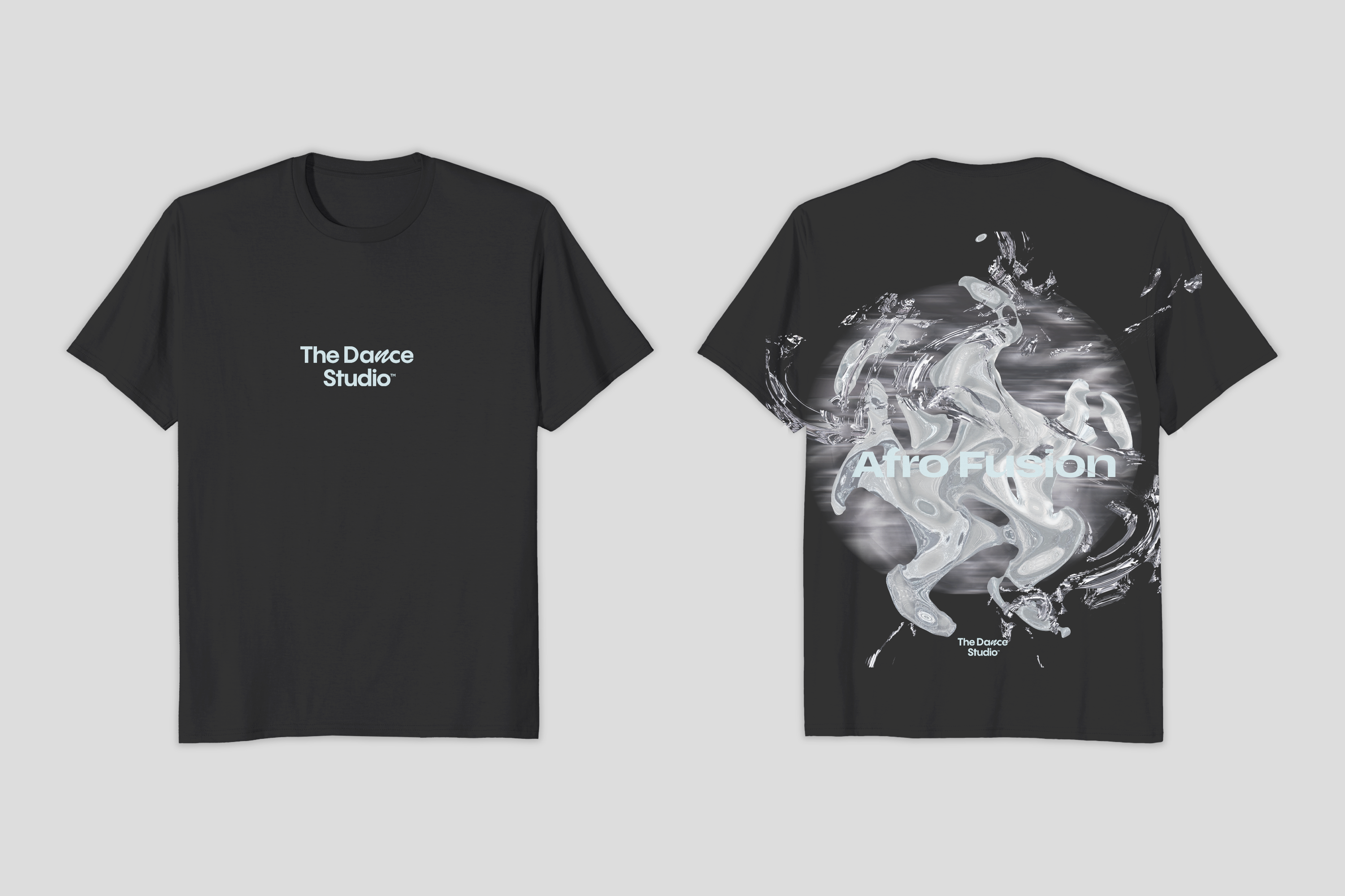
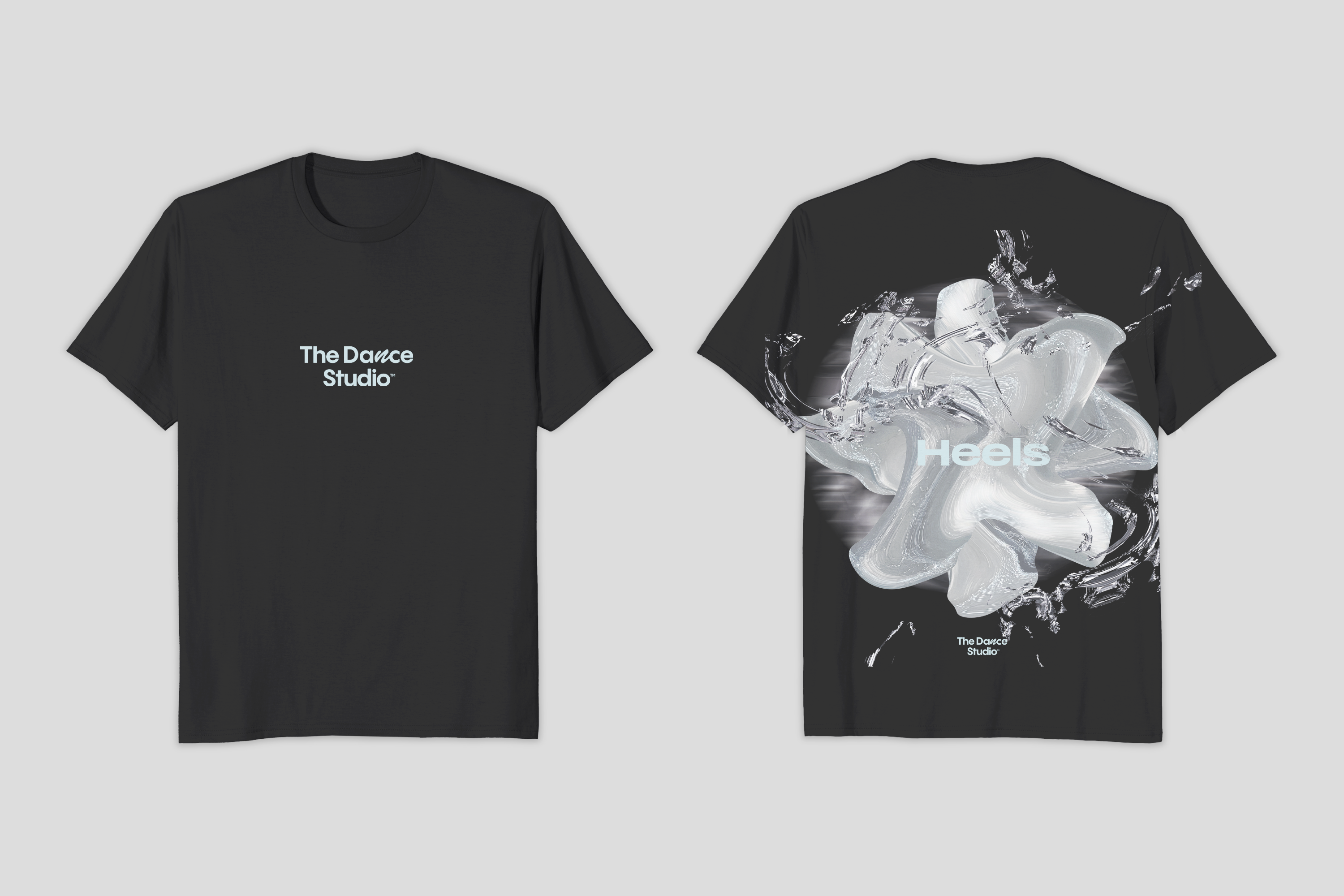
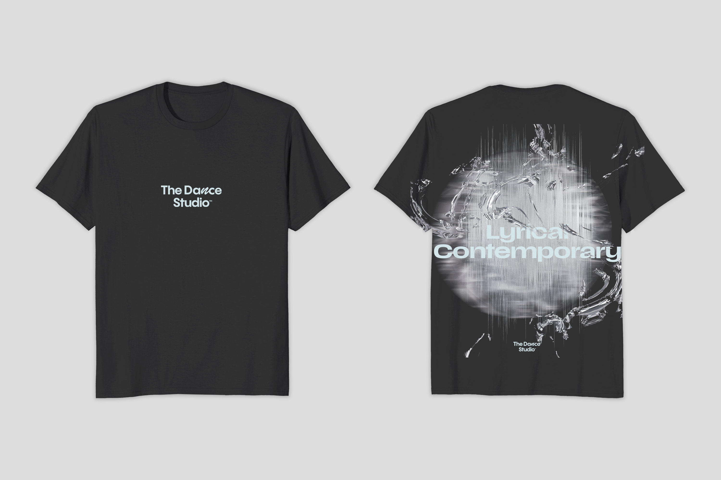
The Dance Studio
Brand Identity
The Dance Studio's brand identity is designed to celebrate movement in a futuristic and innovative way. Each dance style is represented through sleek, modern design elements that set it apart from traditional dance representations. Inspired by minimalist aesthetics and silver tones, the visual identity merges organic movement with cutting-edge design, creating an atmosphere of empowerment and creativity.
The pattern used in the branding symbolizes constant motion, with fluid, circular shapes anchoring the design to reflect the continuous flow of dance. The choice of Scale VF font highlights the versatility and individuality of dance, emphasizing that movement takes on many forms and expressions.
This unique approach fosters a supportive, inclusive space where self-expression thrives. The Dance Studio’s brand identity invites dancers of all kinds to explore and celebrate their authentic selves in a modern, judgment-free environment where creativity and well-being come together.
Medium: Mixed Media.
Location: Riyad, Saudi Arabia
Year: 2025
Please note that the Logo Design was not created by our studio.
Main Pattern:


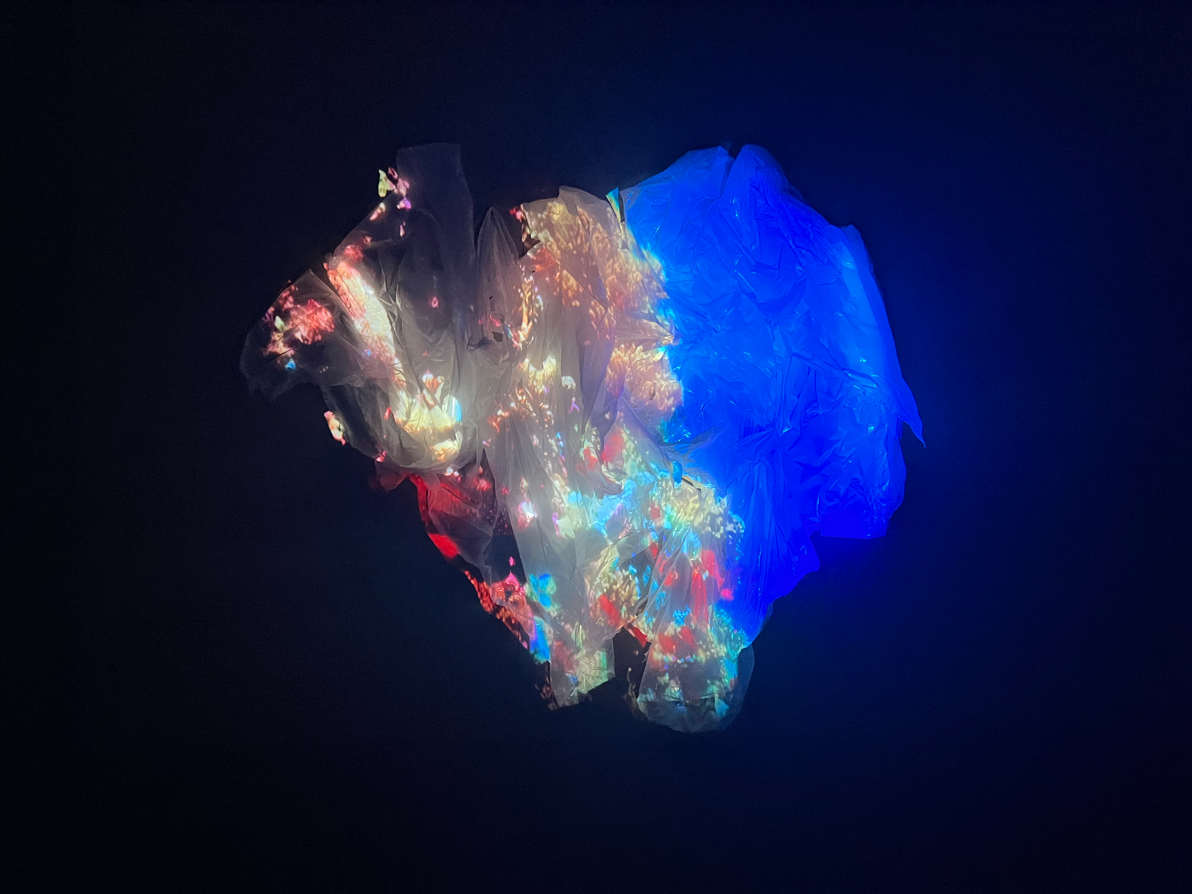
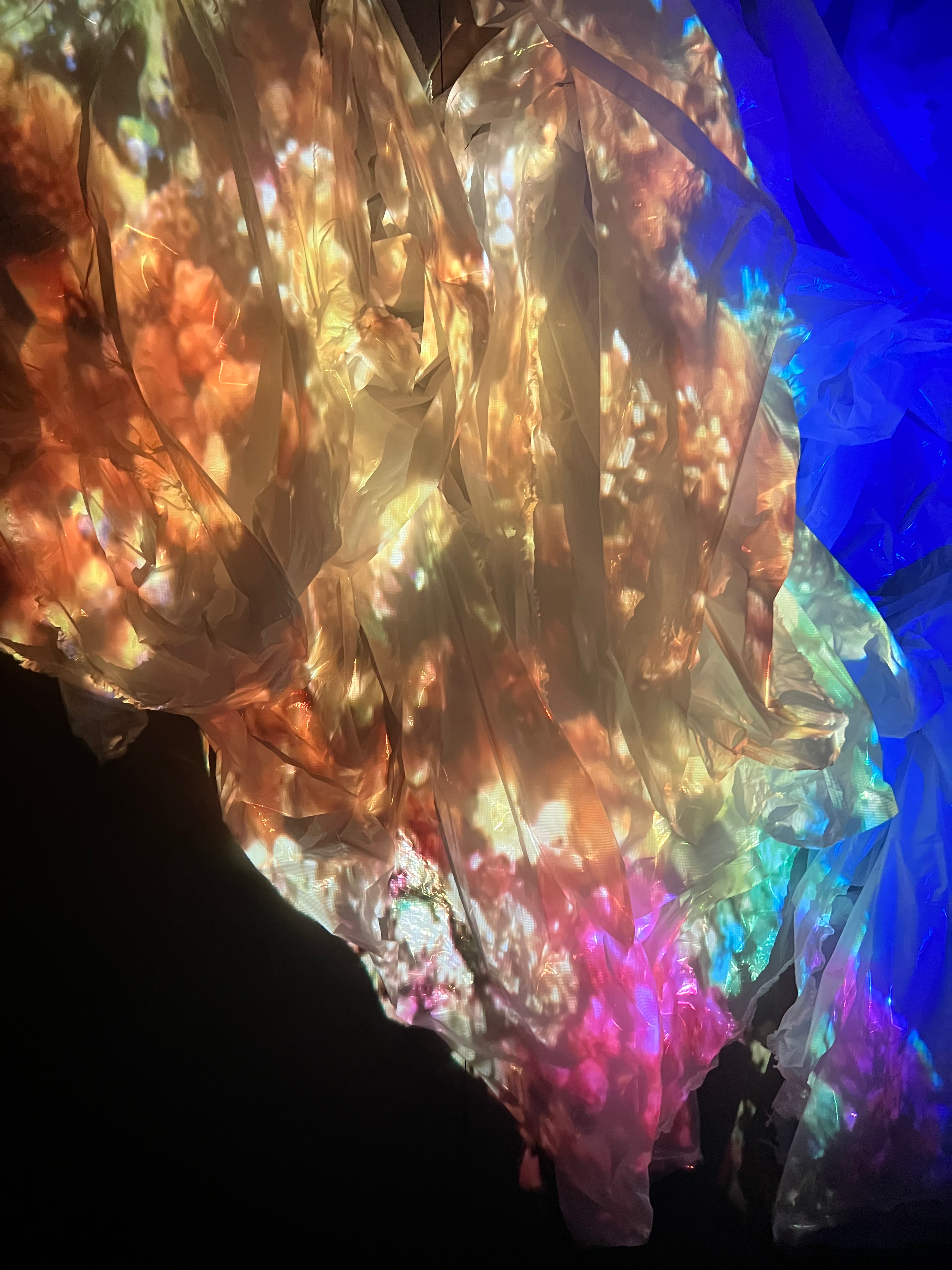
Coral
Based on environmental issues.
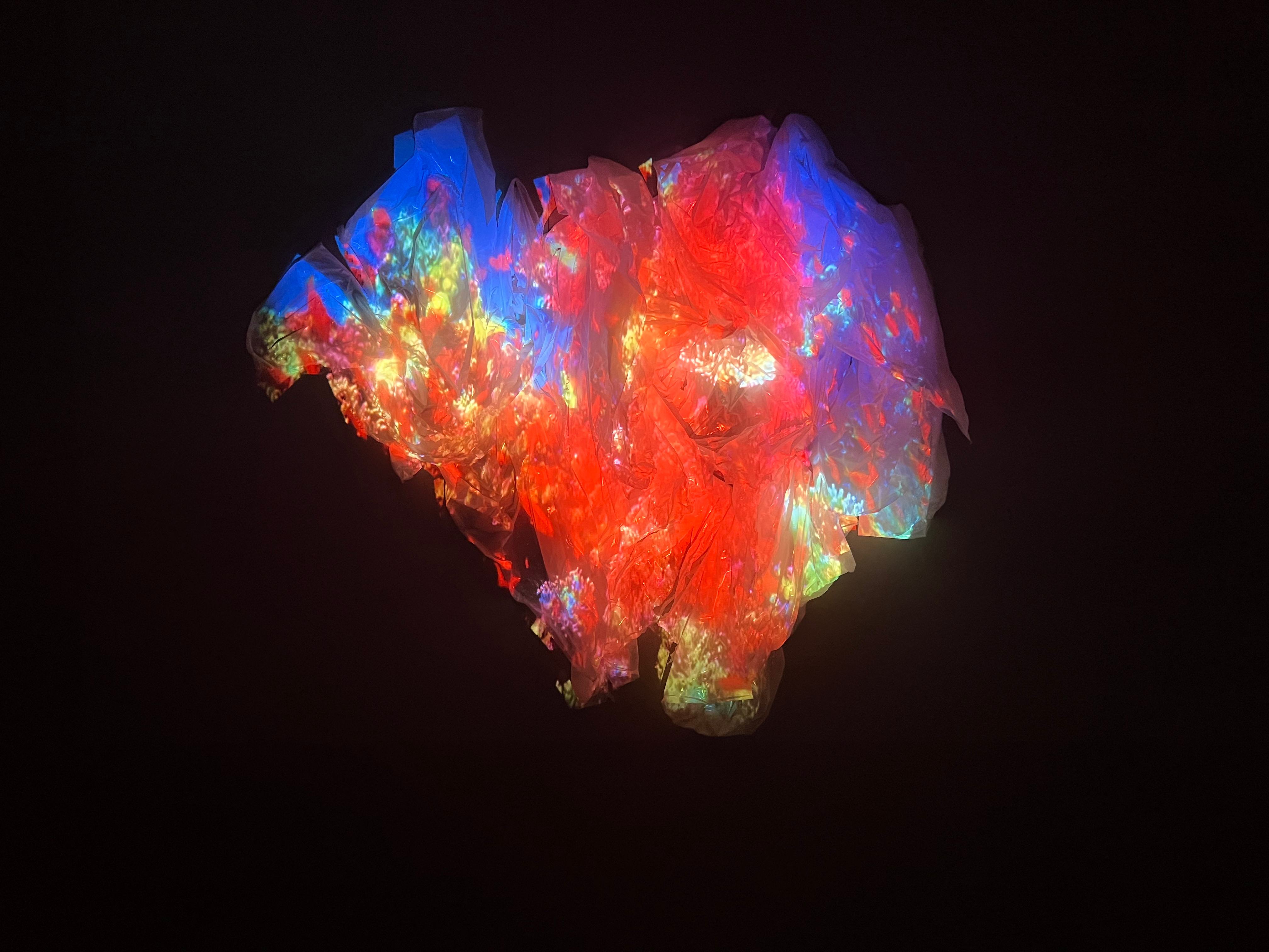
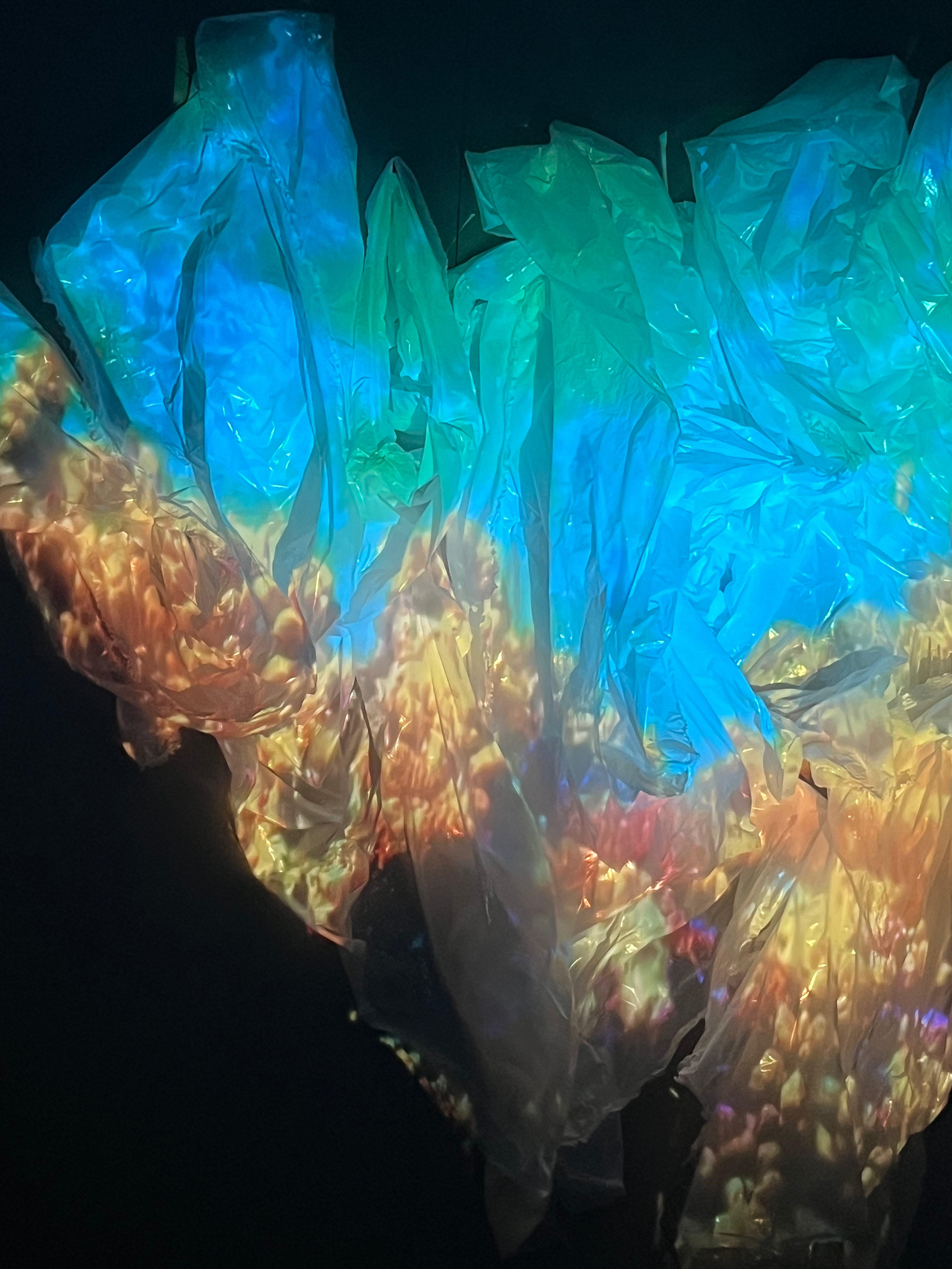
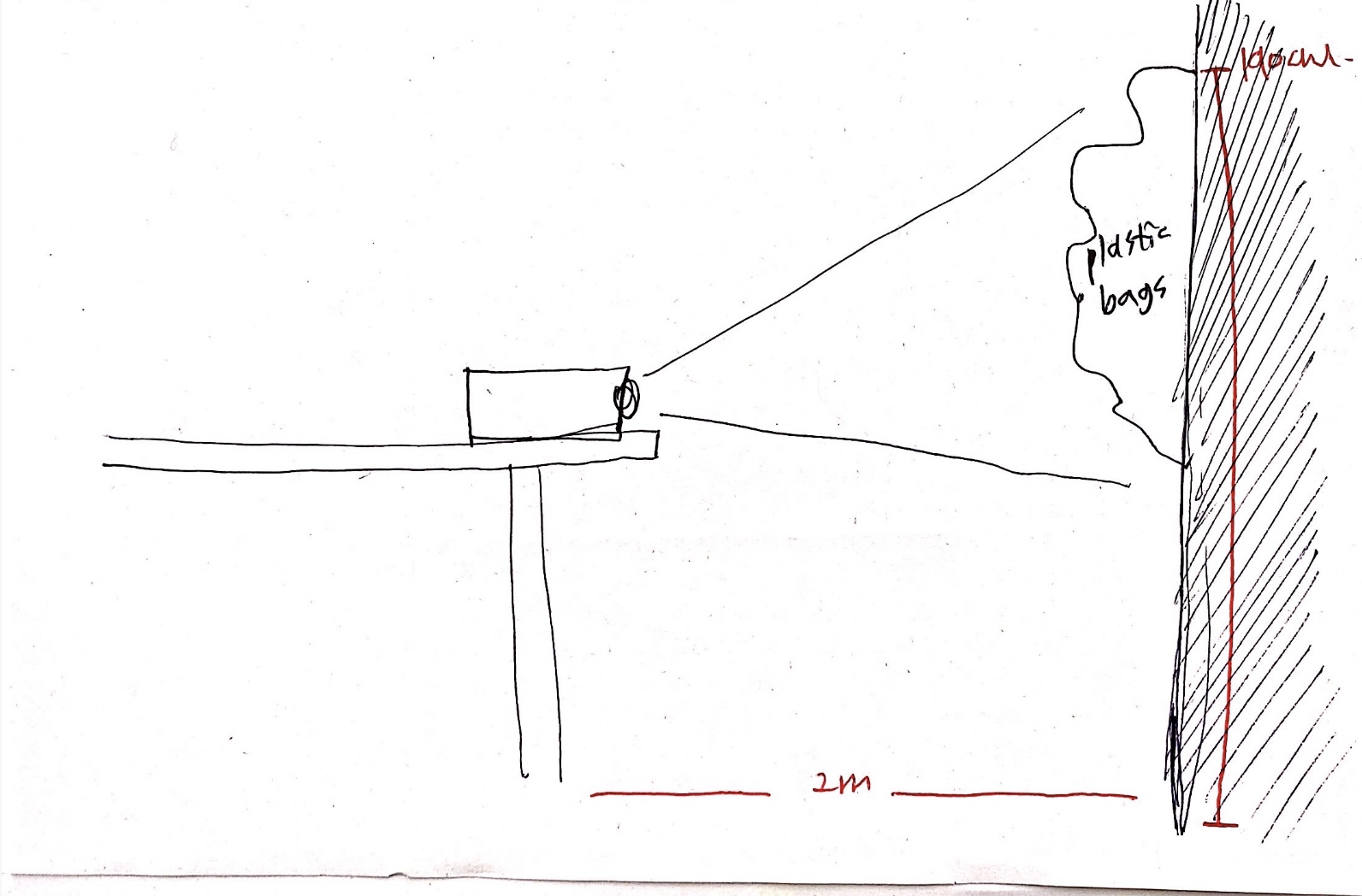
Coral is a project designed to raise awareness about the environmental impact of single-use plastics and to encourage individuals to reduce their consumption of these materials. By highlighting the connection between plastic waste and the health of coral reefs, the project aims to foster a deeper understanding of the urgent need for sustainable practices. Through compelling visuals and messaging, Coral advocates for a shift toward more eco-friendly alternatives, empowering people to make choices that protect both the environment and marine life.
Medium: Projection Mapping, Plastic, Sound Design
Size: 28X36”
Year: 2024
Collaborative work, Partner: Seri Kwag
Video credits:


STUCK IN A BEAUTIFUL MEMORY
Metaphor poster and stickers
The poster explores the theme of being trapped in a beautiful memory that no longer exists, promoting a lecture series about a man who remains deeply in love with a woman long after her death. The design visually captures the emotional tension between holding on to the past and the pain of its absence. Through evocative imagery and symbolic elements, the poster conveys the bittersweetness of love that transcends time, inviting viewers to reflect on the lasting impact of memories and the challenge of moving forward.
Medium: Mixed Media, Collages.
Size: 18X24”
Year:2018
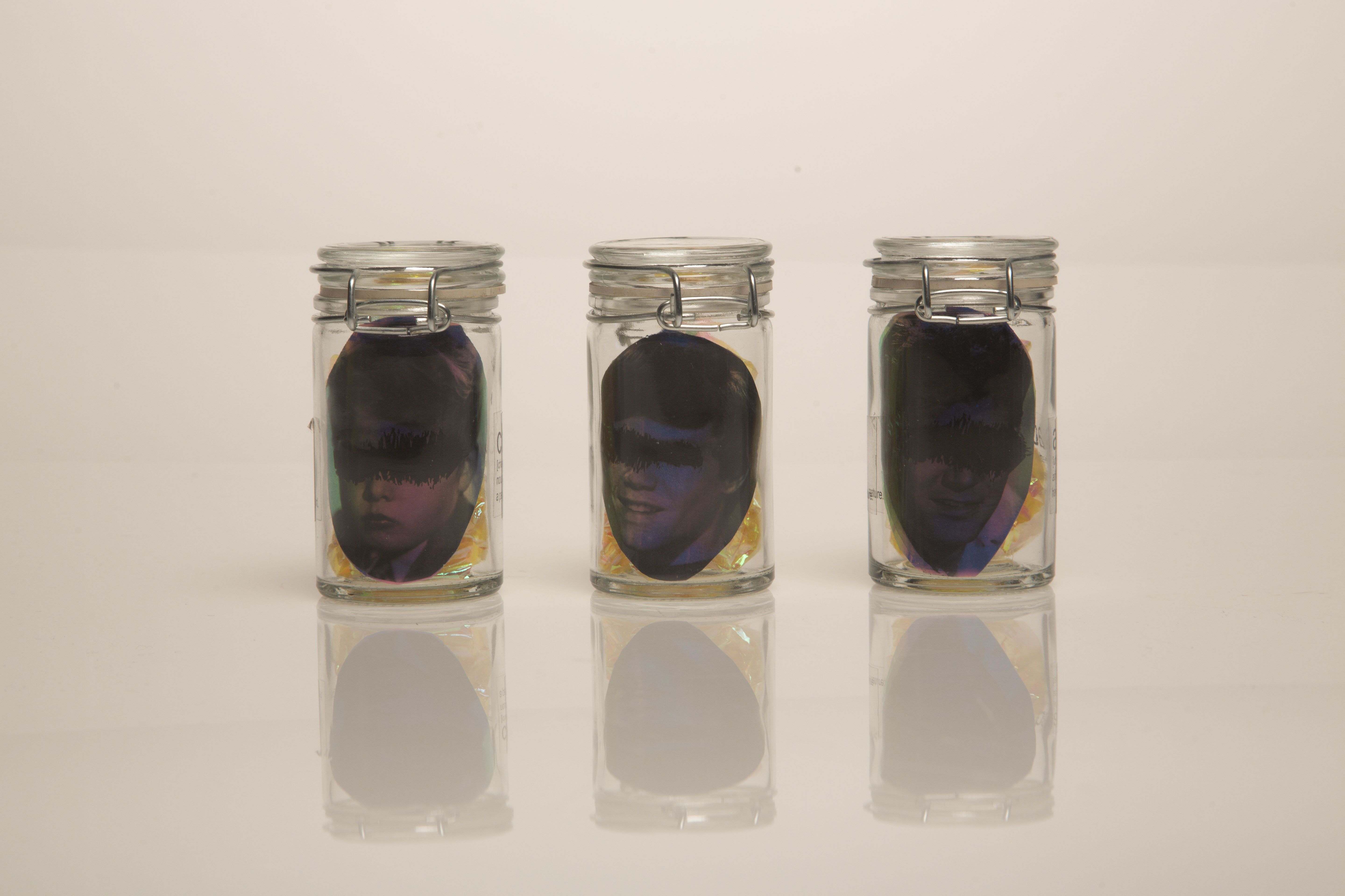
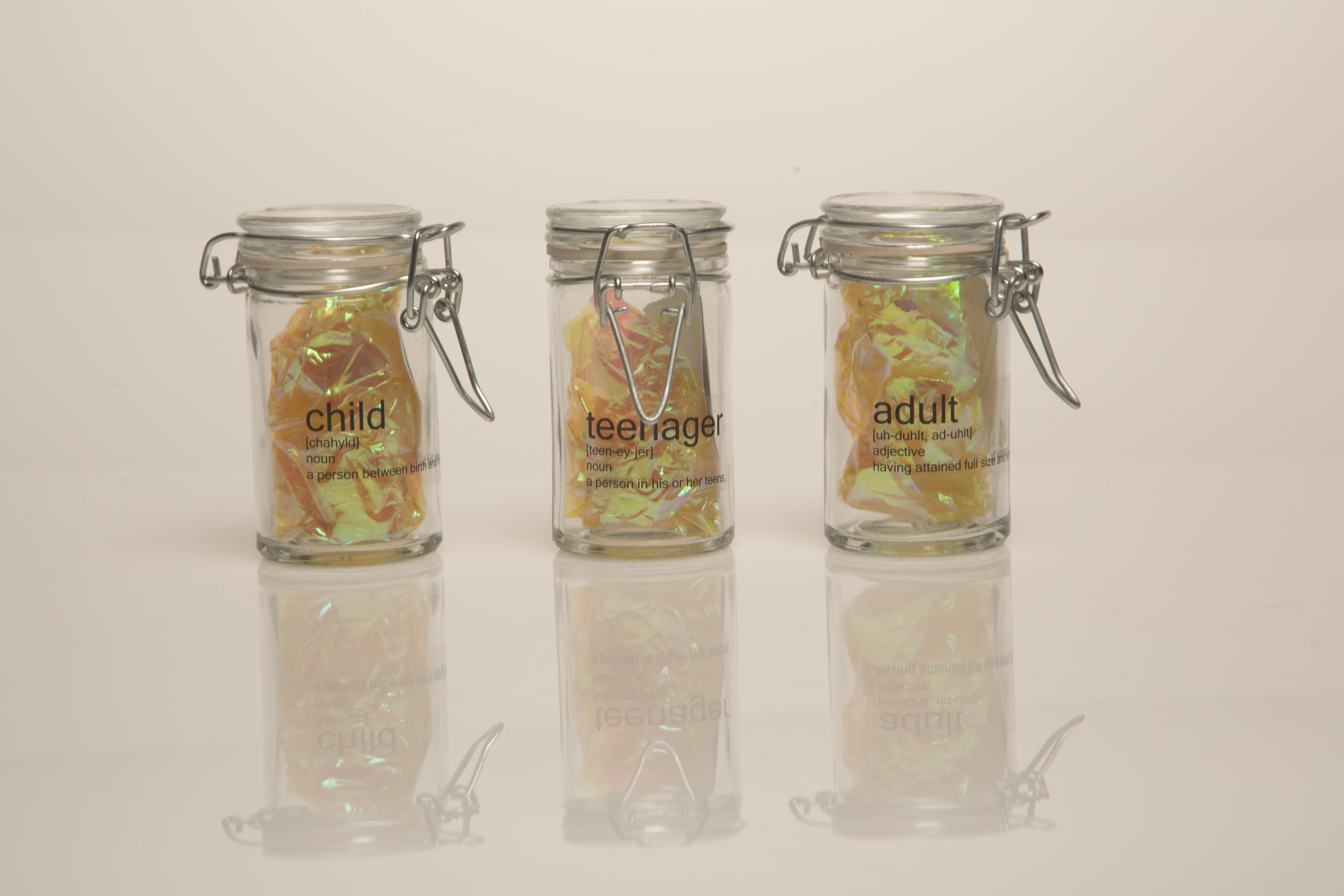
Human being stages Stickers pack
After the lecture, each participant will receive a set of three stickers enclosed in a locked jar—symbolizing the feeling of being stuck.
These are called “The Human Being Stages Stickers,” representing different stages of personal or emotional development. Participants are invited to choose the stage where they’ve felt the most stuck and place that sticker on a collective poster—turning personal reflection into a shared visual dialogue.

Poster Design
Sticker Design
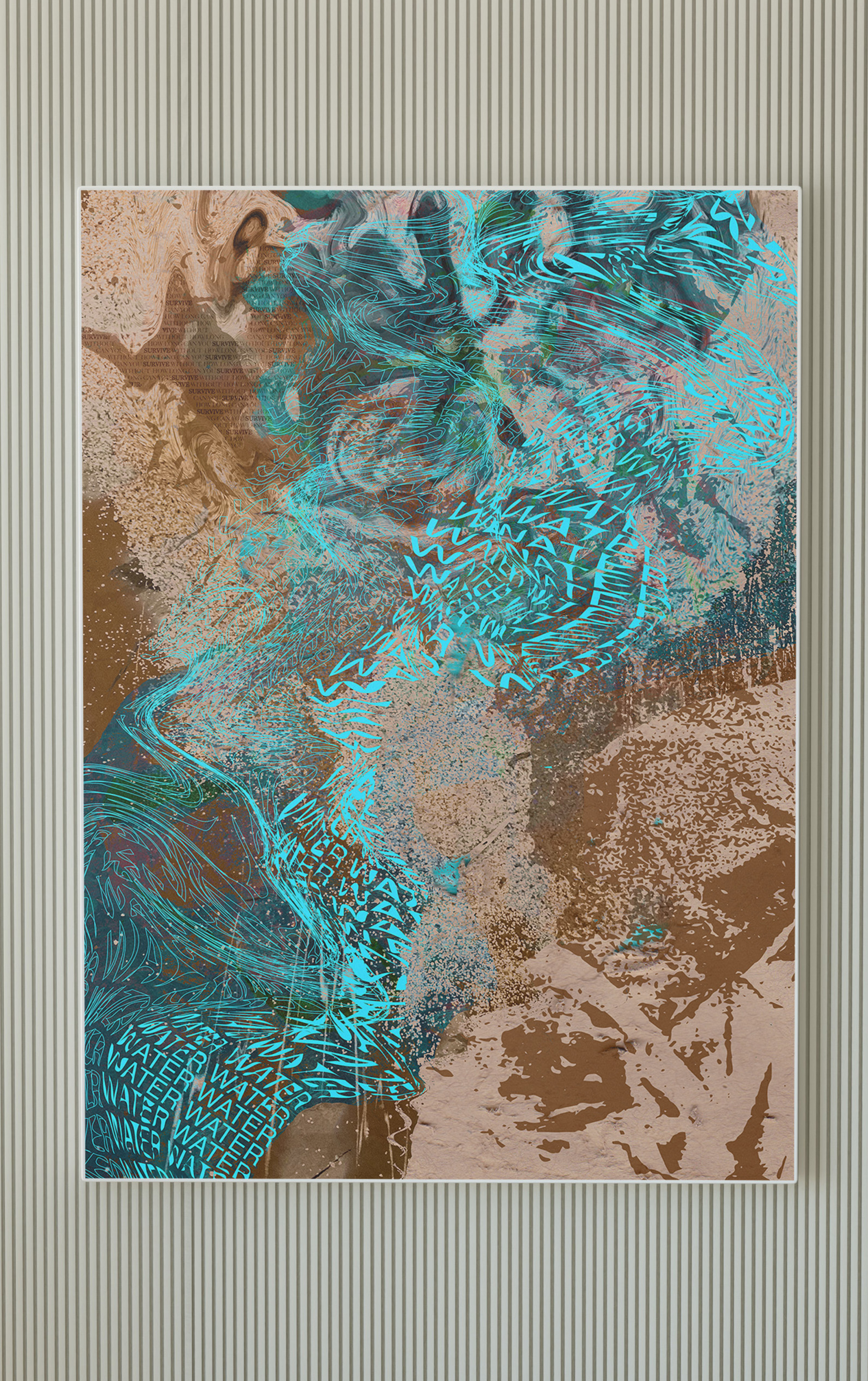
HOW LONG CAN YOU SURVIVE
The project discusses the critical issue of water scarcity through both digital and analog processes, blending modern technology with traditional techniques to emphasize the urgency of the problem. The digital process involves creating interactive visuals and data-driven graphics to illustrate the global impact of water shortages, while the analog approach uses physical elements like hand-drawn illustrations, paper textures, and tangible representations of water-related imagery to evoke a more personal, emotional connection to the issue. By merging these two methods, the project aims to highlight the importance of water conservation, engage the audience on a deeper level, and prompt action to address this growing environmental crisis.
The paper used is recycled in different Shapes, colors, and weightsMedium: Mixed Media,
Size: 28X32” cut in different shapes
Year:2020

LINKEDIN: LULU ALGHOFAILI EMAIL: LULU.ALGHOFAILI@GMAIL.COM
INSTGRAM: LULU.ALGHOFAILI